To make a mobile website mockup video, record your site at a real phone viewport and user agent so it shows its mobile layout, then place the recording in a phone frame on a background and export it as a vertical 9:16 video. On a Mac you can emulate a phone with Safari's Responsive Design Mode or Chrome DevTools device mode, record the viewport with Shift-Command-5, and frame it in Keynote or a video editor. GlidePage, a Mac app for Apple Silicon, does it in one step: it loads the page as a real phone would, scrolls it inside an accurate iPhone, Pixel or Galaxy frame, and exports a 2160 × 3840 video.
On this page
Most people will meet your website on a phone first, and most of the places you share it (Reels, TikTok, Shorts, Stories) are vertical. A short video of the site scrolling inside a phone fits all of them, and it shows something a desktop screenshot never can: how the mobile design actually feels.
This guide covers why the real mobile layout matters, three ways to capture it, how to choose between iPhone, Pixel and Galaxy frames, the vertical formats each platform expects, and a faster way to do it on a Mac.
Why the real mobile layout matters#
The most common mistake in phone mockups is a desktop page scaled down to fit a phone screen. It looks wrong straight away: tiny text, a desktop navigation bar, columns side by side. Viewers who use the site on their phone know it does not look like that.
It happens because the mobile design is not a smaller copy of the desktop one. A responsive site switches layout with CSS media queries based on the width of the viewport, and a phone's viewport is narrow. Some sites also check the browser's user agent to decide what to serve, and some change behaviour for touch screens, such as replacing hover menus with tap menus. If you capture the page at desktop width and shrink it, none of that happens.
Mobile browsers have their own twist. As MDN explains, a phone can render a page in a virtual viewport wider than its screen and shrink the result, unless the page sets a viewport meta tag. Well-built sites set it, which is exactly why you need a real phone-sized viewport to see what their visitors see.
So the rule is simple: capture the page at a phone's viewport, with a phone's user agent, then put it in a phone frame.
Three ways to capture the mobile version#
| Method | Shows the real mobile layout | Smoothness | Clean screen | Effort |
|---|---|---|---|---|
| Record on a real phone | Yes | Hand scrolled | Browser bars and status bar in the shot | Low, then cleanup |
| Emulate a phone on your Mac | Yes, for most sites | Hand scrolled | Clean if you record only the viewport | Medium |
| A dedicated app | Yes | Even and eased | Clean, with a correct status bar | Low |
Record on a real phone
Start a screen recording from Control Center on your iPhone, open the site in Safari and scroll. You get the genuine rendering, but also the browser's address bar and toolbar, whatever is in your status bar, and any notification that arrives. The scroll is a flick of your thumb, which rarely reads as smooth on video. It is the quickest way to get a rough clip, not a polished one.
Emulate a phone on your Mac
Desktop browsers can pretend to be a phone, which gives you the mobile layout in a window you can record cleanly.
In Safari: turn on the Develop menu in Safari's Advanced settings, then choose Develop → Enter Responsive Design Mode. Click a device at the top of the page to use its size. A pop-up menu lets you change the user agent and another the device pixel ratio.
In Chrome: open DevTools and press Command-Shift-M to turn on the device toolbar. Choose a phone from the Dimensions menu. Device presets set the viewport size and the user agent for you, which is better than typing a width.
Reload the page after switching, so the site sees the new user agent. Then scroll through once to load images, scroll back up, and record just the viewport with Shift-Command-5 and Record Selected Portion. How to record a scrolling screen on Mac has the recording steps and the habits that keep it smooth.
Chrome's own documentation calls device mode a first-order approximation: it runs Chrome's engine at a phone size, not the phone's real browser and hardware. For a mockup video that is usually fine, since the layout is what matters.
Put the recording in a frame
Once you have the clip, place it in a phone frame on a background, in Keynote or a video editor. Adding an iPhone frame to a screen recording walks through the sizing, the rounded corners and the free Keynote method step by step.
Get the page ready for a phone-sized shot#
A phone screen is small, so clutter that is harmless on desktop can take over the whole frame. Before you record, however you record:
- Cookie and consent banners often cover a third of a phone screen. Accept or dismiss them first.
- Chat bubbles and app install prompts sit over the content in the bottom corner or along the top. Close them.
- Sticky bars such as a fixed header or a bottom call-to-action stay on screen for the whole video. That is fine if they are part of the design, but check that they do not cover the content you want people to read.
- Lazy images and fonts should be loaded before the take, so scroll to the bottom and back first.
- Text size matters more on a phone. If the headline is hard to read in the frame, the video will not work on a feed either.
iPhone, Pixel or Galaxy?#
Pick the phone your audience holds. It sounds obvious, but it changes how the video is received: people recognise their own phone at a glance.
| Situation | Frame |
|---|---|
| A general audience, or you are unsure | A current iPhone |
| An Android app, or an Android-first market | A Pixel or Galaxy phone |
| A cross-platform app | One of each, side by side |
| A design portfolio | Whichever phone you use everywhere else, for consistency |
Within a family, use a current model. An outdated phone, such as one with a Home button, makes the work look older than it is, and its screen shape is different from what visitors see today.
Frame colours
The frame colour is part of the design:
- Black or dark frames disappear against dark backgrounds and keep attention on the screen. They suit most sites.
- Silver, white or light frames feel fresh and suit bright, minimal designs on light backgrounds.
- Coloured frames can echo a brand colour, but keep the background calm if the phone itself is bold.
Vertical formats for Reels, TikTok, Shorts and Stories#
A phone mockup is naturally tall, so a vertical 9:16 video is the obvious fit:
| Platform | Shape | Useful numbers |
|---|---|---|
| Instagram Reels (ads guide) | 9:16 | 1440 × 2560 recommended; keep 14% at the top, 35% at the bottom and 6% on each side free of key content |
| TikTok (in-feed ads) | 9:16 recommended | At least 540 × 960; safe zone templates are available from TikTok |
| YouTube Shorts | Square or vertical | Videos up to three minutes in a square or vertical shape count as Shorts |
Instagram and Facebook Stories take the same vertical video; Meta's Reels ads guide lists them as placements alongside Reels.
A few practical points:
- Mind the overlays. Captions, buttons and profile icons sit over the bottom of vertical videos. Place the phone so the part of the page you care about is in the upper and middle area.
- Make the first second count. Start on the hero, already in motion or about to be. A blank phone loses people.
- Keep it short. 10 to 20 seconds covers most landing pages. Loop it if the platform allows.
- Add text in an editor. A headline above the phone works well on a 9:16 background; leave room for it.
For landscape feeds such as LinkedIn and X, put the phone on a 16:9 or square background, or pair it with the desktop version. Website videos for LinkedIn and X covers their specs.
Making it with GlidePage#
GlidePage is a Mac app that turns a link into a scrolling video, and phone mockups are where it saves the most steps:
- Paste the link. A public page, or a local one such as a dev server on localhost:3000 or a staging address on your network.
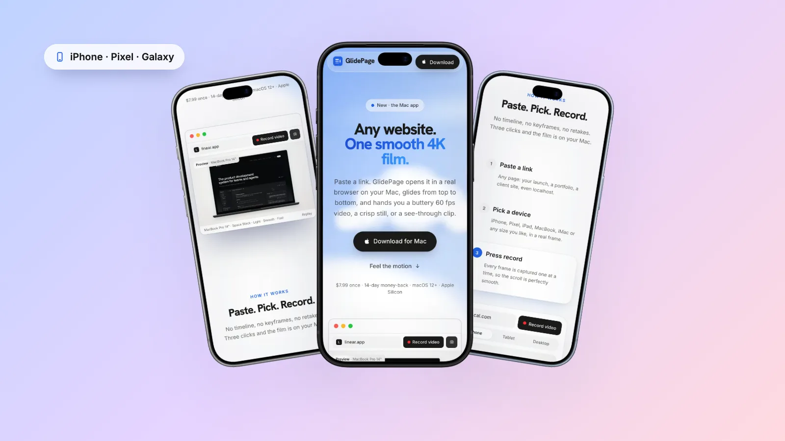
- Pick a phone. Current iPhones, including iPhone 18 Pro and Pro Max, iPhone Air and the 17 and 16 series, plus Google Pixel and Samsung Galaxy phones, in their real colours. The page loads with a real phone user agent and viewport, so the site shows its actual mobile design.
- Check the top of the screen. Frames include the status bar and the Dynamic Island or notch placement, with safe areas respected, so page content does not hide under them.
- Choose a background and motion. Light, Midnight, Aurora, Sunset, or any colour or gradient, and one of six motion curves. Page by page, which pauses on each screen, works well for mobile landing pages where every section has a message.
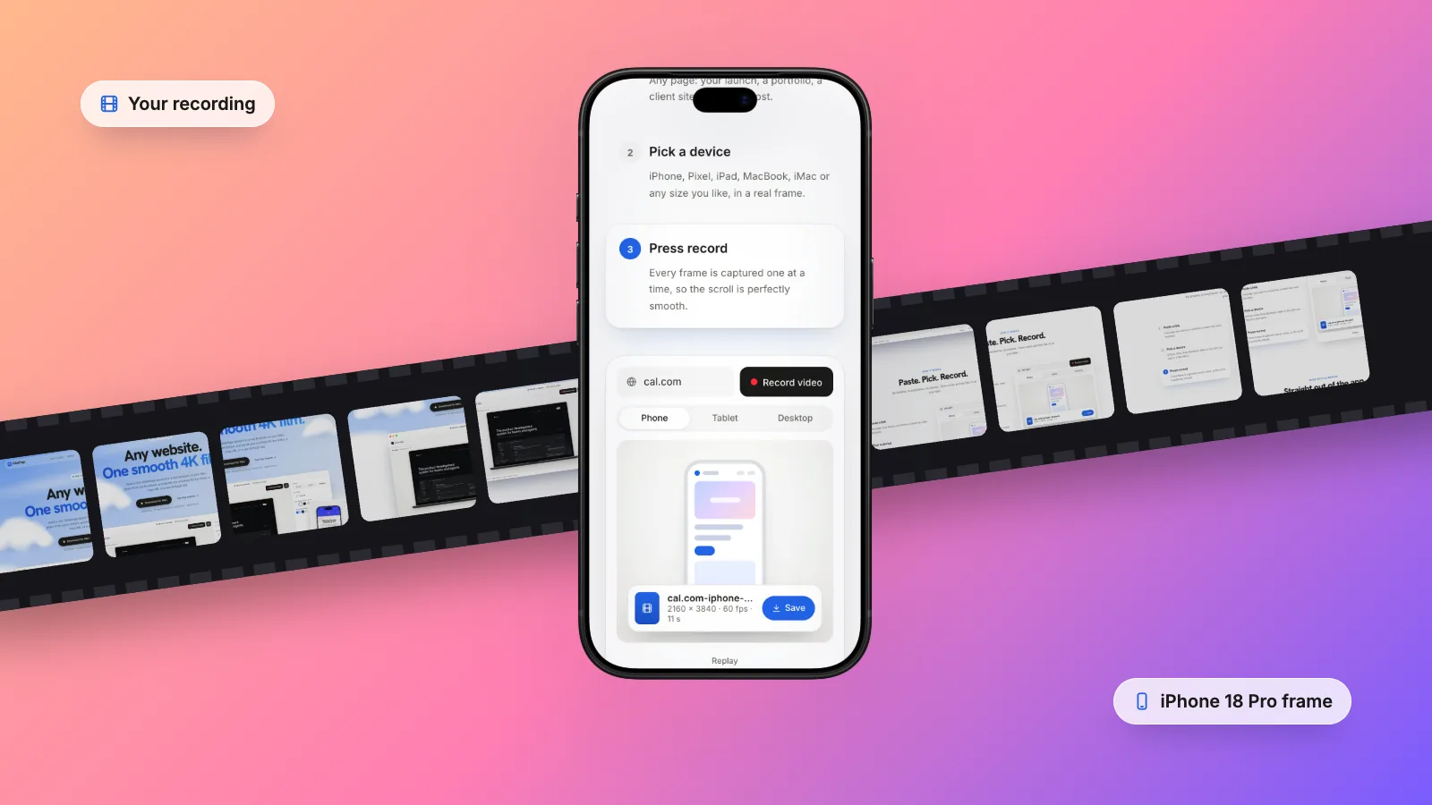
- Press Record. It scrolls through once so images and animations load, captures each frame one at a time, and exports a 4K MP4. A framed phone on a background comes out at 2160 × 3840, which is exactly 9:16.
A few details help with mobile in particular. Cookie banners take up a large part of a phone screen, and GlidePage hides common ones by default, though some custom banners can still appear. It can record the site in light or dark mode. Everything runs on your Mac, so an unreleased site is never uploaded. It cannot record pages behind a login, and it does not add text, captions or music, so add those in an editor afterwards.
Desktop and phone together#
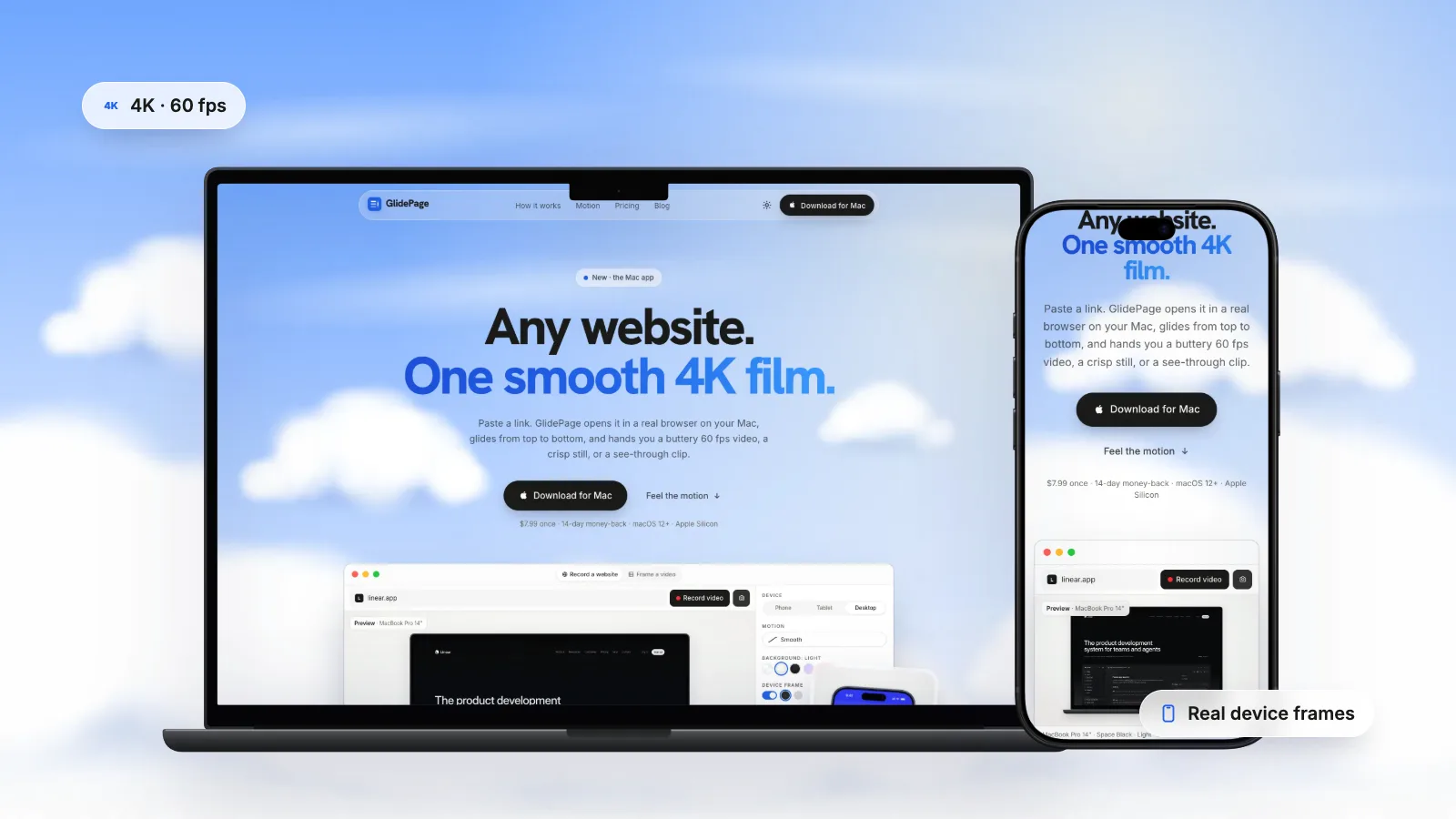
A responsive mockup video shows the same site on a laptop and a phone at once. It proves the design works at every size, and it fits landscape feeds well.
- Record the desktop and phone versions separately, with the same background and a similar speed, so they feel like a pair.
- Place them side by side in Keynote or a video editor on a 16:9 background, the laptop larger and the phone overlapping its lower corner.
- Trim both to the same length, so they start and finish together.
Scrolling website mockups covers laptop frames and the Keynote setup in more detail.
Checklist before you post#
- The page shows its real mobile layout, not a shrunken desktop page.
- Nothing important hides behind the status bar, Dynamic Island or rounded corners.
- No cookie banner, chat bubble or app install prompt covers the content.
- The phone model and frame colour suit the audience and the brand.
- The video is 9:16 for vertical platforms, with key content clear of the bottom overlays.
- It starts on the hero and lasts 10 to 20 seconds.
For more on the scroll itself, including speed and motion, see how to make a scrolling video of a website.
Sources
- MDN: Viewport meta tag (checked September 2026)
- Safari Developer Help: Responsive Design Mode (checked September 2026)
- Chrome DevTools: Simulate mobile devices with device mode (checked September 2026)
- Meta Ads Guide: Instagram Reels video ads (checked September 2026)
- TikTok Ads: In-feed video ad specifications (checked September 2026)
- YouTube Help: Understand three-minute YouTube Shorts (checked September 2026)



Make your site move.
Any page, one smooth 4K video. Framed, on any background, or transparent.
Questions, answered
How do I record the mobile version of my website on a Mac?
Emulate a phone in your browser, then record the viewport. In Safari choose Develop → Enter Responsive Design Mode and click a phone; in Chrome open DevTools, press Command-Shift-M and pick a phone from the Dimensions menu. Reload the page, then record with Shift-Command-5 and Record Selected Portion.
Why does my website look like the desktop version in a phone mockup?
Because it was captured at desktop width and shrunk. Responsive sites switch to their mobile layout based on the viewport width, and some also check the user agent. Capture the page at a phone viewport with a phone user agent, and it shows the design visitors actually see.
What size should a mobile mockup video be for Instagram Reels and TikTok?
Vertical 9:16. Meta's ads guide recommends 1440 × 2560 for Reels, and TikTok recommends 9:16 at 540 × 960 or larger for in-feed video ads. A 2160 × 3840 export is also 9:16 and gives the platforms a sharper source.
Should I use an iPhone or an Android phone in my mockup?
Use the phone your audience uses. A current iPhone is a safe default for a general audience, a Pixel or Galaxy suits Android apps and Android-first markets, and a cross-platform product can show one of each side by side.
How long should a mobile website mockup video be?
Usually 10 to 20 seconds. That is enough to show the hero and the main sections of a landing page without losing people. Longer pages can scroll a little faster, or pause briefly on each screen.
Can I make a mobile mockup video of a site that is not live yet?
Yes. Browser emulation works on any page your Mac can open, including a local dev server. GlidePage can also record localhost, LAN and .local addresses, because it runs on your Mac rather than on a server.