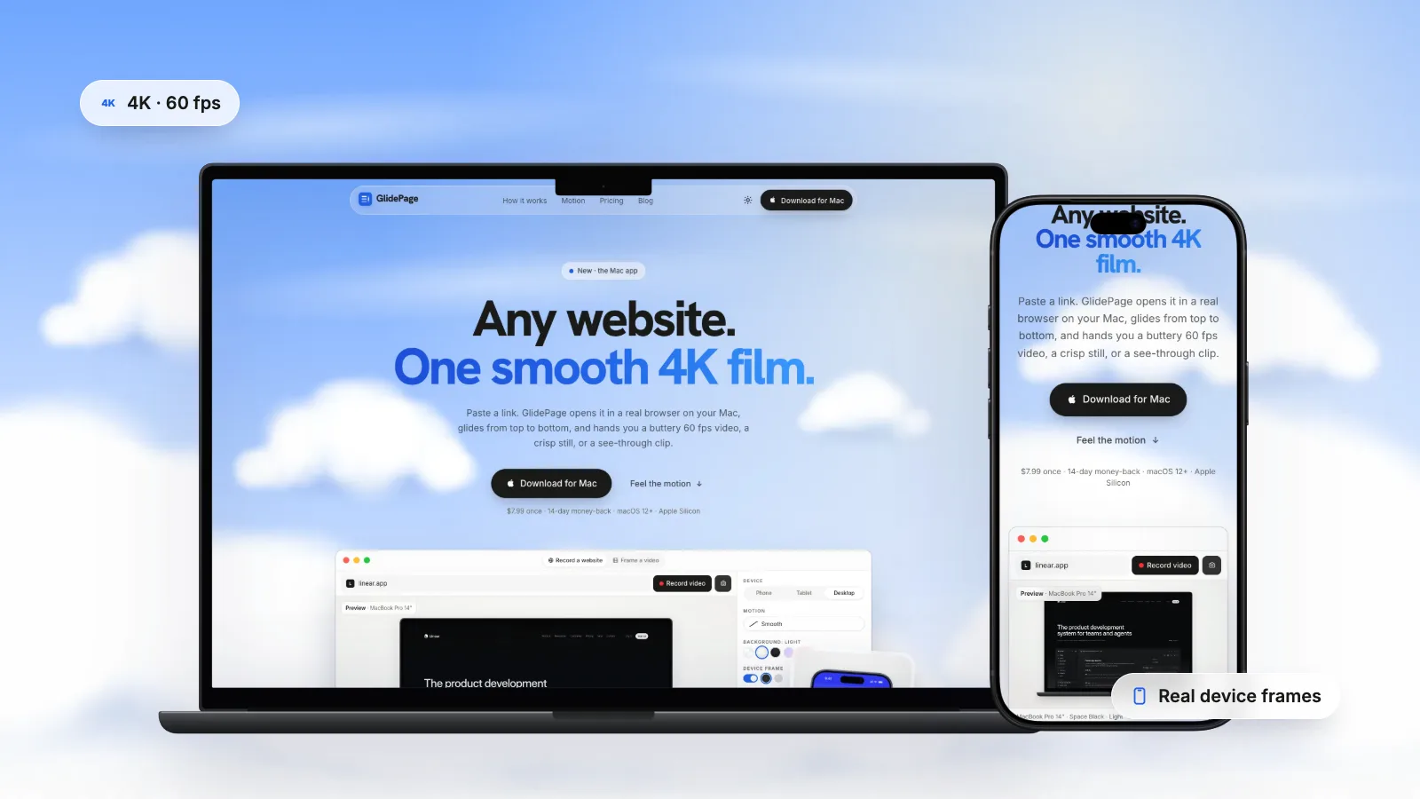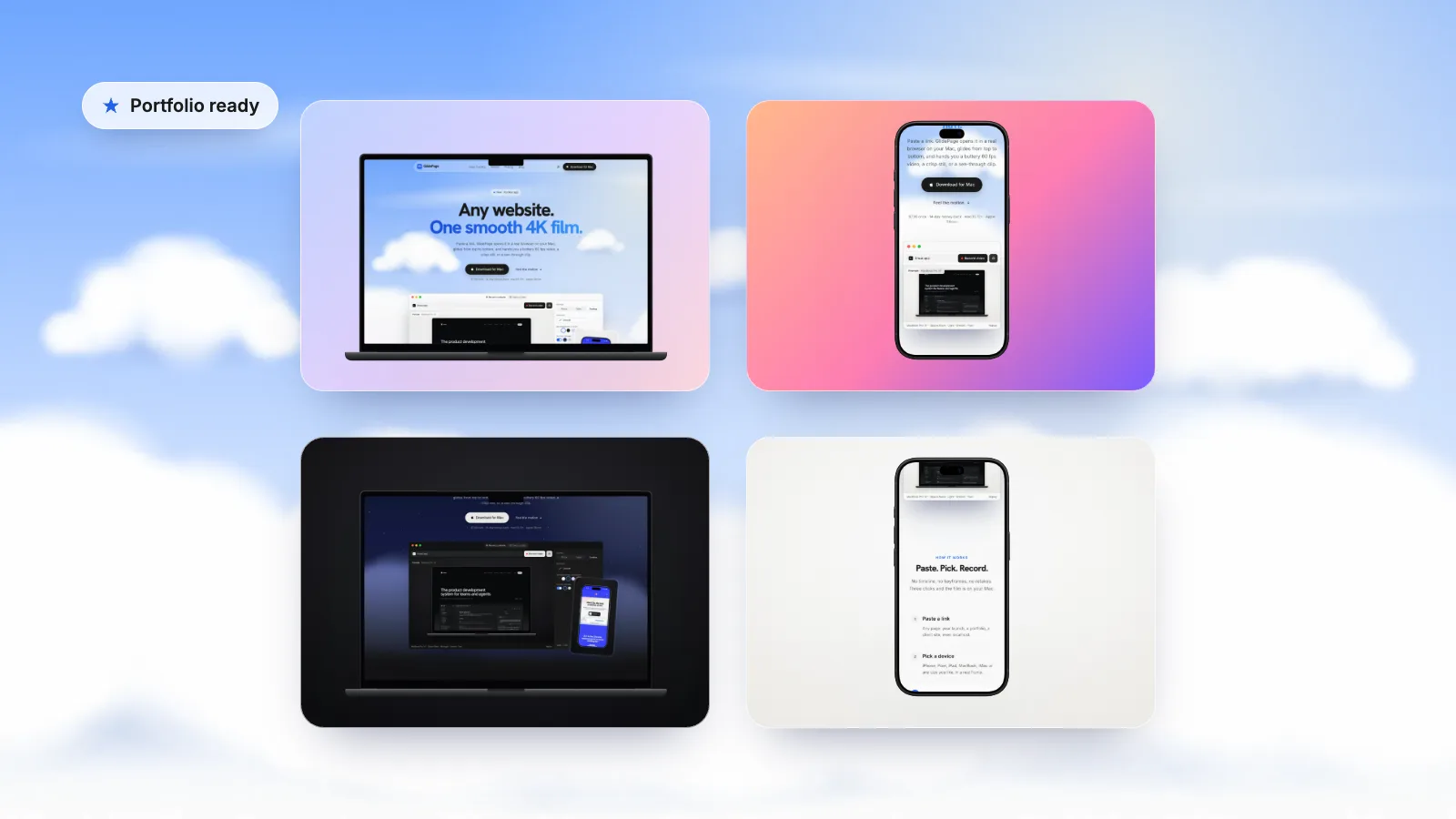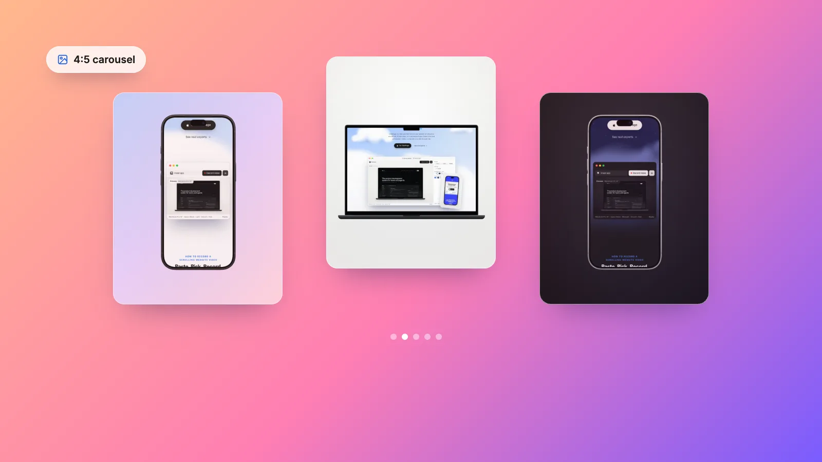
To turn a website into an Instagram carousel, make every slide the same portrait shape, 4:5 at 1080 × 1350 pixels or larger, because Instagram applies one orientation to all the photos in a carousel and crops anything that does not fit. The free way is to take screenshots on your Mac, crop them in Preview, place them on a 1080 × 1350 slide in Keynote with a background colour, and export the slides as images. Crop to one section per slide, or use the mobile layout, so the text stays readable. GlidePage, a Mac app for Apple Silicon, takes 4K stills of any point on a page at 4:5 on a background, inside a laptop or phone frame, in light or dark mode.
On this page
- Instagram image sizes and carousel rules
- Plan the slides before you capture anything
- Why desktop screenshots look tiny at 4:5
- The free method: screenshots on a 4:5 canvas in Keynote
- Photo mode in GlidePage
- Text and layout go in a design tool
- Mixing a video slide into the carousel
- PNG or JPEG, and alt text
- Checklist before you post
Search for how to post a website on Instagram and most answers are about links: where to put the URL in your bio or a story. This guide is about something else. It is about showing the design itself, as a carousel of images that people swipe through in their feed.
That is a great format for a new site, a redesign or a portfolio piece, but it has two traps. Instagram crops slides that do not match the carousel's shape, and a full desktop screenshot shrunk into a phone-sized square is almost unreadable. Below: the sizes Instagram actually uses, how to plan the slides, a free method with tools already on your Mac, and a faster one.
Instagram image sizes and carousel rules#
These rules come from Instagram's own help pages:
- Width. Instagram keeps photos between 320 and 1080 pixels wide at their original resolution. Wider photos are sized down to 1080 pixels wide, and smaller ones are enlarged to 320.
- Shape. The supported range runs from 1.91:1 (landscape) to 3:4 (portrait). A photo outside that range is cropped to fit a supported ratio.
- Carousels. A single post can hold up to 20 photos and videos. The orientation you choose (square, portrait or landscape) applies to every photo and video in the post; you cannot pick a different one for each slide. You can drag each photo to adjust how it sits in the frame, which is another way of saying the rest gets cropped.
So the rule for a carousel that does not get cropped is simple: make every slide the same shape, inside the supported range, at least 1080 pixels wide.
| Shape | Ratio | Size at 1080 wide | Good for |
|---|---|---|---|
| Portrait | 4:5 | 1080 × 1350 | Most website carousels: taller than a square, well inside the range |
| Tallest supported | 3:4 | 1080 × 1440 | The most height, if every slide can be made at 3:4 |
| Square | 1:1 | 1080 × 1080 | A single device on a background |
| Landscape | 1.91:1 | 1080 × 566 | Rarely worth it: it takes the least room in the feed |
This guide uses 4:5. It fills more of the screen than a square and sits comfortably inside the supported range. You can upload larger files at the same shape, such as 2160 × 2700; Instagram sizes them down to 1080 wide.
Plan the slides before you capture anything#
A carousel is a short story told one swipe at a time. Decide what each slide says before you take a single screenshot:
| Slide | What it shows | Tip |
|---|---|---|
| 1. Hook | The site in a device frame, with a short line of text | This is the only slide most people see in the feed; make it clear what the site is |
| 2. Hero | The top of the homepage, close enough to read the headline | Crop tight; this is the first impression |
| 3 to 5. Key sections | One section per slide: features, pricing, a signature detail | One idea per slide |
| 6. Mobile | The same site on a phone | Proves the design is responsive |
| 7. Detail | Typography, a component, a before and after | Designers love these; clients understand them |
| 8. Result or call to action | What changed, or where to see it live | Tell people where the link is |
Six to ten slides is plenty for most sites, well under the limit of 20. Keep the device, background and margins the same on every slide so the carousel reads as one piece. Profile grid thumbnails do not always show the whole first slide, so keep the edges of that slide free of anything essential.
Why desktop screenshots look tiny at 4:5#
A laptop screen is wide, and a 4:5 slide is tall. Place a full desktop screenshot on a 1080 × 1350 slide with a small margin and it covers less than half of the slide's height. The text suffers more: a page designed at 1440 pixels wide and scaled to fit, then shown on a phone at roughly 400 points wide, turns 16-pixel body text into something around 4 points tall. Nobody can read that while scrolling.
Three fixes, which you can combine:
- Crop to a section. Instead of the whole screen, take a 4:5 slice of it: the hero, one feature block, the pricing table. A slice half as wide doubles the size of everything in it.
- Use the mobile layout. A phone layout is already tall and its text is sized for a phone, so it fits a 4:5 slide far better. A phone frame on a slide keeps text at roughly twice the size of a full desktop shot.
- Zoom the page before capturing. Browser zoom at 150% makes the type and layout larger, and the page reflows to fit. Some sites switch to a narrower layout when zoomed, which often looks better in a tall slide.
If the problem is sharpness rather than size, capture at a higher resolution; high-resolution website screenshots covers how.
The free method: screenshots on a 4:5 canvas in Keynote#
Everything here is built into macOS. Preview crops, Keynote provides the 4:5 canvas and the background.
1. Take the screenshots
Open the site, dismiss the cookie banner, zoom the page if you need to, and scroll to the section you want. Press Shift-Command-4 and drag across the part of the page to capture; release to take the shot. It lands on your desktop. Repeat for each slide. For the mobile view, a browser's responsive design mode shows the phone layout on your Mac.
2. Crop them in Preview (optional)
Open a screenshot in Preview, show the Markup toolbar, choose the crop tool and drag over the area to keep. To see the size of your selection while you drag, choose Tools → Show Inspector. Then click the crop button. Aim for a slice that is roughly 4:5 or a little wider.
3. Make a 4:5 slide in Keynote
Create a new presentation. In the Document sidebar, click the pop-up menu below Slide Size, choose Custom Slide Size, enter 1080 by 1350 and click OK.
4. Add a background and the screenshot
Select the slide and use the Background controls in the Format sidebar to set a colour fill or a gradient fill. Drag a screenshot onto the slide and resize it, leaving an even margin on every side. Duplicate the slide for each screenshot so every slide shares the same size, background and margins.
5. Add text if you need it
The hook slide and the last slide usually need a line or two of text. Keynote's text boxes are fine for this; keep the type large.
6. Export the slides as images
Choose File → Export To → Images, select the slides and an image format, then save. Upload them from your computer on Instagram: click Create, then Post, then Select from computer, use the multiple-selection button to add up to 20 files, and drag them into order before you share.
It is free and it works. The weak points are the screenshots themselves: they are limited to your display's resolution, a desktop screenshot is not a phone layout, and device frames are extra work. To put a screenshot inside a device frame by hand, you need a frame image with a transparent screen and some patience lining it up.
Photo mode in GlidePage#
GlidePage is a Mac app that turns web pages into scrolling videos and sharp stills. Its photo mode takes the parts that are fiddly by hand, the frame, the background, the 4:5 shape and the resolution, and does them in one step:
- Paste the link and pick a device: a MacBook, iMac or Windows laptop for the desktop slides, an iPhone, Pixel or Galaxy phone for the mobile slide. Phones load the site with a real phone user agent and viewport, so you get the actual mobile layout.
- Choose a background (Light, Midnight, Aurora, Sunset, or your own colour or gradient) and set the aspect ratio to 4:5.
- Press the camera, scroll to the spot you want with the scrollbar, and press it again. You get a 4K PNG of that point on the page, framed on the background. In our test, a 4:5 photo in a MacBook Pro 14 frame came out at 2160 × 2700 pixels: exactly twice the 1080 × 1350 that Instagram keeps, rendered at a high pixel density rather than upscaled.
- Repeat for each slide. Keep the background and the 4:5 ratio the same, and every slide shares one shape, even when you switch from a laptop to a phone.
A few settings help with carousels in particular:
- Page zoom from 50% to 200% changes how large the text is in the frame without changing the output size.
- Light or dark page theme. Sites that support dark mode can show it, which makes a good pair of slides.
- Cookie banners are hidden by default. Anything the filter misses, you can close in Take control or remove with Hide element before you shoot.
- Transparent stills. With a frame and no background, the PNG is transparent, ready to place on your own slide design.
- Local sites. It can capture a site on localhost or your local network before launch.
Each still is one viewport at the position you choose, not a stitched full-page image. If the page needs a login, sign in with Take control first. Everything runs on your Mac, with nothing uploaded. It needs an Apple Silicon Mac with macOS 12 or later.
Text and layout go in a design tool#
GlidePage has no text, arrows or layout tools, and neither do the screenshots. The words on your hook slide, labels, and the final call to action are added afterwards, in Keynote or whatever design tool you already use. A few habits make them work on a phone:
- Keep headlines large: they are read at the size of a phone screen, not a monitor.
- Put text in the space around the device, not on top of the page.
- Use the same margins, type and colours on every slide.
- Keep the whole carousel at the same 4:5 size, including text-only slides.
Mixing a video slide into the carousel#
Carousels take videos as well as photos, and one moving slide among stills catches the eye: a short scroll through the homepage works well as slide two or as the final slide. Two things to know from Instagram's help:
- The orientation applies to videos too, so a video slide should be 4:5 like the rest, or it will be cropped.
- Videos in a carousel are not reels. They do not appear in the Reels tab or get reel features.
GlidePage can record the same page as a video on the same 4:5 background, so the moving slide matches the stills. If you want a vertical clip for Reels as well, how to turn a website into a vertical video for Reels, TikTok and Shorts covers the 9:16 version.
PNG or JPEG, and alt text#
Save website slides as PNG. Website slides are mostly flat colour and sharp text, which PNG stores without loss. JPEG compression smears the edges of small text and adds noise around them. Instagram processes every upload anyway, and sizes anything wider than 1080 pixels down, so give it the cleanest file you can. PNG files are larger, which does not matter for a handful of slides.
Write your own alt text. Instagram generates automatic alt text with object recognition, and it will not know your slide is a pricing page. When you post from a computer, click Accessibility after editing, then write the alt text in the box. To change it after posting, open the post's options, click Edit, then Accessibility. Describe what each slide shows, such as the site's name, the section and the headline, for people using a screen reader.
Checklist before you post#
- Every slide is the same shape: 4:5, at least 1080 × 1350
- Slide one says what the site is, with nothing essential near its edges
- One idea per slide, cropped close enough to read on a phone
- A mobile slide showing the real phone layout
- Same device, background and margins throughout
- No cookie banner, chat bubble or pop-up in any shot
- Any video slide is also 4:5
- Saved as PNG, with alt text written for the post
For a portfolio, these stills pair well with short scrolling videos; web design portfolio videos covers how to record every site at handoff. For the full guide to the video side, see how to make a scrolling video of a website.
Sources
- Instagram Help Center: Image resolution of photos you share on Instagram (checked September 2026)
- Instagram Help Center: Share a post with multiple photos or videos (checked September 2026)
- Instagram Help Center: Edit the alternative text for a post (checked September 2026)
- Preview User Guide: Crop, resize or rotate an image (checked September 2026)
- Keynote User Guide: Change the slide size (checked September 2026)
- Keynote User Guide: Export to PowerPoint or another file format (checked September 2026)



Make your site move.
Any page, one smooth 4K video. Framed, on any background, or transparent.
Questions, answered
What size should an Instagram carousel be?
Use 4:5 portrait at 1080 × 1350 pixels for every slide. Instagram keeps photos up to 1080 pixels wide and supports shapes from 1.91:1 to 3:4, so 4:5 fits comfortably. Larger files at the same shape, such as 2160 × 2700, are sized down to 1080 wide.
How do I post screenshots on Instagram without cropping?
Place each screenshot on a canvas of one shared shape, such as 4:5, with a background around it, and upload those images instead of the raw screenshots. Instagram applies one orientation to every photo in a carousel and crops anything that does not match, so the canvas has to be the same for every slide.
How many slides can an Instagram carousel have?
Up to 20 photos and videos in one post. For a website, six to ten slides is usually enough: a hook, the hero, a few key sections, the mobile view and a closing slide.
Why do my website screenshots look tiny on Instagram?
A desktop screenshot is wide, so on a tall 4:5 slide it is scaled down to fit the width and its text shrinks to a few points on a phone. Crop each slide to one section, show the mobile layout, or zoom the page before capturing so the text is larger.
Should I use PNG or JPEG for Instagram posts of a website?
PNG. Website slides are mostly flat colour and sharp text, which PNG keeps clean, while JPEG compression blurs small text. Instagram processes the upload either way, so starting from a clean file gives the best result.
Can I mix videos and photos in an Instagram carousel?
Yes. A carousel can hold both, but the orientation you choose applies to every item, so make the video the same shape as the photos. Videos in a carousel are not treated as reels and do not appear in the Reels tab.