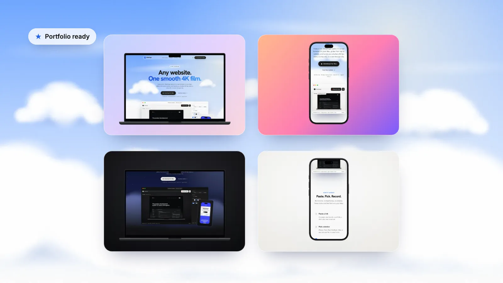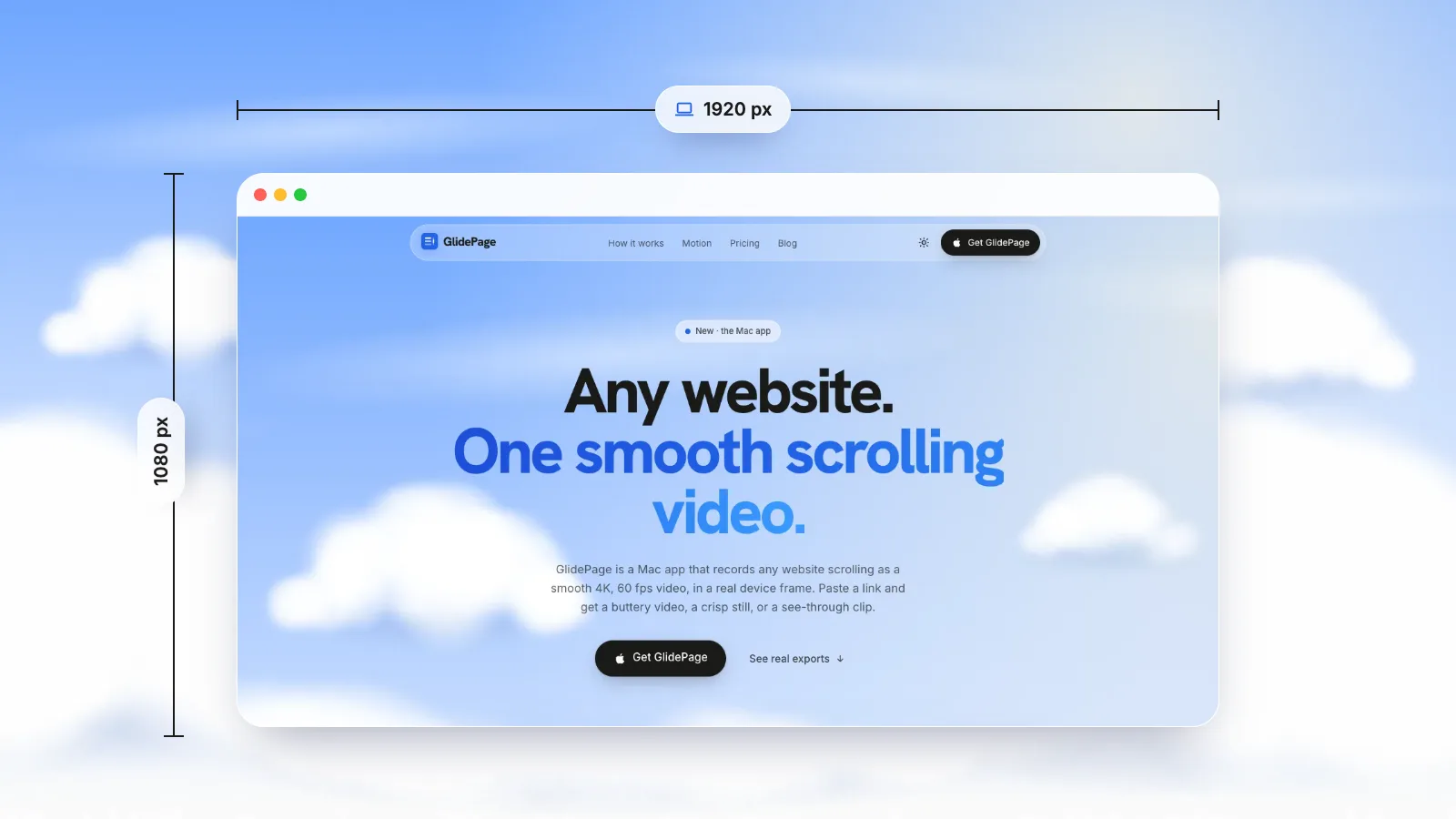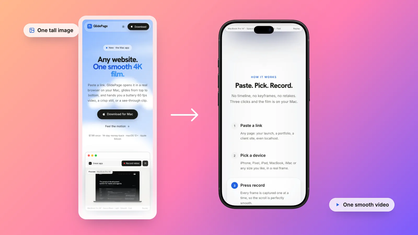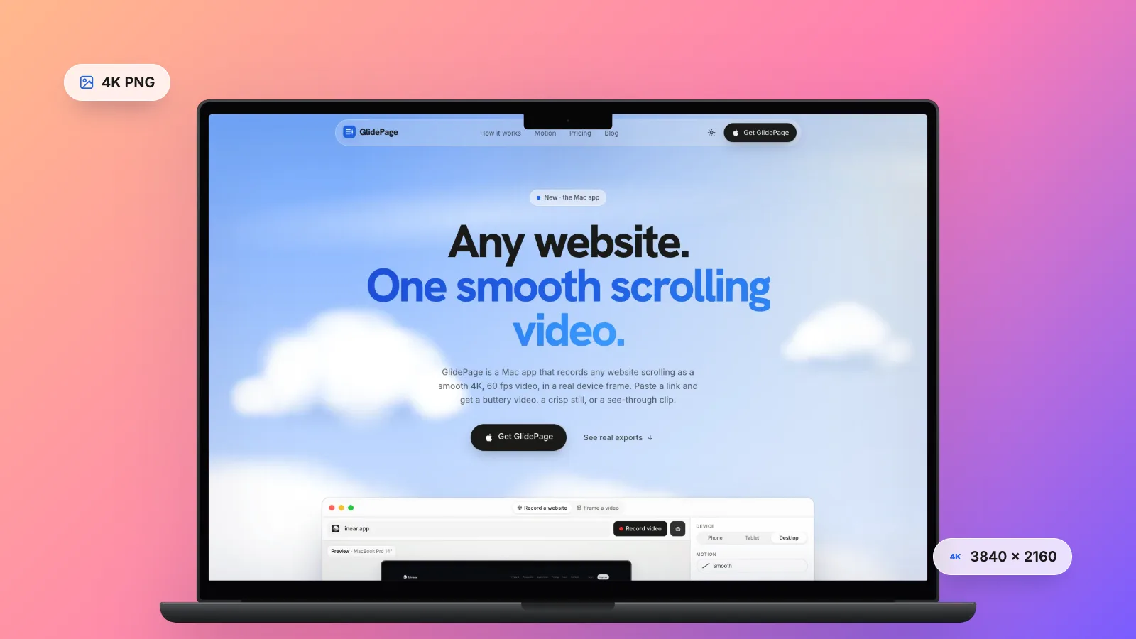
On a Retina Mac, Shift-Command-4 already captures two pixels for every point, so a selection 1440 points wide gives an image 2880 pixels wide. For a true 4K (3840 × 2160) screenshot on any screen, open Chrome DevTools, turn on the device toolbar, set a Responsive viewport of 1920 × 1080, add a device pixel ratio of 2 and choose Capture screenshot; a ratio of 3 goes past 4K. Save it as PNG, because lossy JPEG blurs the edges of text. GlidePage, a Mac app for Apple Silicon, has a photo mode that saves a 4K PNG of any screen of a page, rendered at high pixel density, in a device frame or on a transparent background.
On this page
- Why website screenshots come out blurry
- Points, pixels and device pixel ratio
- Method 1: Shift-Command-4 on a Retina Mac
- Method 2: 4K and beyond with Chrome DevTools
- Two more free options: Safari and page zoom
- What size do you need?
- PNG, JPEG or WebP?
- A 4K still of any screen with GlidePage
- Before you capture: a checklist
You take a screenshot of a website, it looks crisp on your screen, and then it goes soft somewhere along the way: in a portfolio grid, a case study, a slide, a social post. The headline is fuzzy, thin lines smear, and small text is unreadable.
The good news is that a Mac can capture a web page at 4K and beyond for free, with nothing to install. This guide explains why screenshots lose their sharpness, walks through the free methods step by step, and covers the size and file format to use for each place a screenshot ends up.
Why website screenshots come out blurry#
A blurry screenshot is almost always one of these:
- Too few pixels to begin with. A capture from a standard (1×) external monitor has one pixel per point. Shown on a Retina laptop or a phone, which use two or more screen pixels for each CSS pixel, it gets stretched.
- Shown bigger than it is. Portfolio templates and slides scale an image to fill its space. A 1,200-pixel image in a column 1,200 points wide on a Retina screen needs 2,400 pixels, so half of them are invented.
- Saved or recompressed as a lossy format. JPEG and other lossy compression throw away detail, and MDN's image format guide points out that blurring and coloured fringes around text and sharp edges are very visible. Upload platforms often resize and recompress again.
- Resized more than once. Each resize resamples every edge. A screenshot scaled for a mockup, then for a template, then by a platform, softens at each step.
The fix is the same for all four: capture more pixels than you will show, keep a lossless master, and let only one resize happen.
Points, pixels and device pixel ratio#
A web page is laid out in CSS pixels. The device pixel ratio (DPR) says how many real screen pixels draw each CSS pixel, in each direction. MDN puts it at 1 for a classic display and 2 for Retina displays, with many phones above 2.
The size of a screenshot is the captured area in CSS pixels multiplied by the DPR:
| Viewport (CSS pixels) | Device pixel ratio | Screenshot size |
|---|---|---|
| 1440 × 900 | 1 (standard monitor) | 1440 × 900 |
| 1440 × 900 | 2 (Retina Mac) | 2880 × 1800 |
| 1920 × 1080 | 2 | 3840 × 2160 (4K) |
| 1920 × 1080 | 3 | 5760 × 3240 |
| 390 × 844 (a phone layout) | 3 | 1170 × 2532 |
That gives you two ways to a bigger image. A larger viewport shows more of the page at the same sharpness. A higher DPR shows the same layout with sharper text. For a crisp image of a design, you want the second. (The same points-and-pixels maths applies to screen recordings; see how to set a browser window to an exact size.)
Method 1: Shift-Command-4 on a Retina Mac#
The built-in screenshot is already high resolution if you take it on a Retina screen.
1. Set up the page
Make the browser window wide enough for the layout you want to show, and scroll to the part of the page you want. Move the pointer off the page so no hover effect is showing.
2. Capture the page area
Press Shift-Command-4 and drag the crosshair over the page, leaving out the tabs and address bar. To capture the whole window instead, press the Space bar and click the window; hold Option as you click to leave out the window's shadow. The screenshot is saved to your desktop.
3. Check the size
Each point you selected becomes two pixels in each direction, so a selection 1,440 points wide is 2,880 pixels wide. That is plenty for a portfolio thumbnail or an image inside a case study.
It has two limits. On a standard external monitor you get half as many pixels, so take the screenshot on the laptop's own screen. And a 4K image (3840 × 2160) needs a 1920 × 1080-point page area, which does not fit on a MacBook screen with the browser's toolbar. For that, use DevTools.
Method 2: 4K and beyond with Chrome DevTools#
Chrome can render a page at any viewport size and pixel ratio, independent of your screen, and save the result as an image. It is free and built in.
1. Open device mode
Open DevTools (Command-Option-I) and click Toggle device toolbar at the top of the panel.
2. Set the viewport
Choose Responsive and type the width and height, for example 1920 and 1080 for a 16:9 desktop view. The width decides which layout the site shows, so pick it for the design you want, not for the pixel count.
3. Add a device pixel ratio
Open More options in the device toolbar, choose Add device pixel ratio, then pick a value from the new DPR menu: 2 for most uses, 3 for extra detail.
4. Capture
Open More options again and choose Capture screenshot. Chrome saves the visible viewport as a PNG at the viewport size times the DPR. At 1920 × 1080 and DPR 2 that is 3840 × 2160, a true 4K image rendered at that density rather than upscaled. At DPR 3 it is 5760 × 3240, well past 4K, so this free method goes further than most people need.
The same menu has Capture full size screenshot for the whole page as one tall image. That is a different job with different problems; how to take a full-page screenshot on Mac covers it.
Capture a single element
Often a crisp detail is more useful than a whole screen: a pricing card, a navigation bar, a hero headline. Select the element in the Elements panel, press Command-Shift-P to open the Command Menu, type "screenshot" and choose Capture node screenshot. It uses the same pixel ratio, so a card 400 CSS pixels wide captured at DPR 3 comes out 1,200 pixels wide. Capture area screenshot lets you drag a rectangle instead (it does not work while DevTools is undocked).
Two more free options: Safari and page zoom#
Safari: capture an element
Turn on Show features for web developers in Safari's Settings, on the Advanced pane. Open Web Inspector from the Develop menu, Control-click an element in the Elements tab, and choose Capture Screenshot. Safari saves a PNG of that element at the screen's pixel density, so 2× on a Retina Mac. It is the quickest way to get one section of a page at full Retina resolution.
Page zoom
Page zoom makes every CSS pixel bigger on screen, and MDN notes that this raises the device pixel ratio: at 200% on a Retina Mac, each CSS pixel is drawn with four screen pixels in each direction. A Shift-Command-4 capture of a single component then has twice as many pixels in each direction as it would at 100%, and the text is rendered at that size, not enlarged afterwards.
The catch: the page now lays out for a viewport half as wide, so a desktop layout may switch to its tablet or phone design. Use zoom for single components, and DevTools for whole screens.
What size do you need?#
A simple rule: export at least twice the width the image will be shown at, because many viewers have a 2× screen. Typical widths vary by template, so measure yours.
| Where it goes | Typically shown at | Capture at least | Good free method |
|---|---|---|---|
| Portfolio grid thumbnail | 400 to 600 points wide | 1,200 px wide | Shift-Command-4 on a Retina Mac, then crop |
| Image inside a case study | 800 to 1,200 points wide | 2,400 px wide | DevTools at 1280 or 1440 wide, DPR 2 |
| Full-width case-study hero | up to 1,920 points wide | 3,840 px wide (4K) | DevTools at 1920 × 1080, DPR 2 |
| A 16:9 slide | full screen | 3840 × 2160 | DevTools at 1920 × 1080, DPR 2 |
| Social post | a phone-width feed | a 4K master, cropped to the shape the platform shows best | Any of the above; check the platform's current guide |
Crop tight. A detail shown near its real size reads far better than a whole page shrunk into a thumbnail. For how to present stills and videos together in a portfolio, see web design portfolio videos.
PNG, JPEG or WebP?#
| Format | Compression | Transparency | Use it for |
|---|---|---|---|
| PNG | Lossless | Yes | Masters, and anything with text or UI. MDN recommends lossless formats for screenshots |
| JPEG | Lossy | No | Photo-heavy pages when file size matters; use a high quality setting |
| WebP | Lossy or lossless | Yes | Serving images on your own site; current major browsers support it |
Keep a PNG as your master and export JPEG or WebP copies only for the places that need them. If a platform will recompress the upload anyway, give it the PNG or a high-quality copy, so it only compresses once.
A 4K still of any screen with GlidePage#
GlidePage is a Mac app that turns a web page into a smooth scrolling video or a sharp still. Its photo mode is built for exactly this kind of image:
- Paste the link and pick a device: a current iPhone, Pixel, Galaxy, iPad, MacBook or iMac, or a custom size. Phone sizes load the site's real mobile layout.
- Press the camera, scroll to the spot with the scrollbar, and press it again.
- Save the PNG through the macOS Save panel.
What you get:
- A 4K PNG, rendered at high pixel density. The page is drawn with enough pixels for 4K, not captured small and upscaled, so text edges are real detail. On a background, the aspect ratio applies to stills too: a 4:5 photo of a MacBook Pro 14 frame comes out 2160 × 2700.
- Framed or transparent. Put the screen in a real device frame on a background, or turn the background off: with a frame and no background, the PNG is transparent.
- Light or dark. Show the page in its light or dark theme, for sites that support it. Record a website in dark mode covers the details.
- No cookie banner. Common consent banners are hidden by default, and anything the filter misses can be closed in Take control or removed with Hide element. See screenshots without cookie banners.
- Bigger text without a new layout. Page zoom from 50% to 200% reflows the layout like browser zoom, while the output resolution stays the same.
- Local sites too. It can capture localhost, LAN addresses and .local hosts.
It is one viewport at the position you choose, not a stitched full-page image. For a page behind a login, sign in with Take control first. It runs on Apple Silicon Macs with macOS 12 or later. Nothing is uploaded.
Before you capture: a checklist#
- Scroll through the page once so lazy images, fonts and reveal animations have loaded, then go back to your spot.
- Deal with the cookie banner: accept it, dismiss it or hide it.
- Pick the layout first (desktop, tablet or phone width), then the pixel ratio.
- Choose the theme: light or dark, to match where the image will sit.
- Move the pointer away so no hover state is showing.
- Save a PNG master, crop it, then export copies for each destination.
- Check it where it lands: open the portfolio, slide or post on a Retina screen and look at the small text.
A sharp still is perfect for detail. If the page has motion worth showing, sticky headers, reveals or a long scroll, a video may say more: how to make a scrolling video of a website is the complete guide.
Sources
- Apple Support: How to take a screenshot on your Mac (checked September 2026)
- Chrome for Developers: Simulate mobile devices with device mode (checked September 2026)
- Chrome for Developers: Run commands with the Command Menu (checked September 2026)
- MDN: Window.devicePixelRatio (checked September 2026)
- MDN: Image file type and format guide (checked September 2026)
- WebKit source: Web Inspector element context menu (Capture Screenshot) (checked September 2026)



Make your site move.
Any page, one smooth 4K video. Framed, on any background, or transparent.
Questions, answered
How do I take a 4K screenshot of a website without a 4K monitor?
Use Chrome DevTools. Turn on the device toolbar, choose Responsive, type 1920 by 1080, add a device pixel ratio of 2 from the More options menu, then choose Capture screenshot. Chrome renders the page at that density independent of your display, so you get a 3840 × 2160 PNG on any Mac.
What device pixel ratio should I use for a website screenshot?
A ratio of 2 suits most uses: it matches Retina Macs and turns a 1920-wide desktop viewport into a 4K image. Use 3 for phone layouts or when you want to crop into details. Higher ratios sharpen text and vector graphics, but photos on the page only improve if the site serves larger versions.
Why does my website screenshot look blurry in my portfolio?
Usually the image has fewer pixels than the space it fills on a Retina screen, or it was saved or recompressed as a lossy JPEG. Export at least twice the width it is shown at, keep a PNG master, and avoid resizing it more than once.
Should I save website screenshots as PNG or JPEG?
PNG. It is lossless, so text and thin lines stay crisp, and it supports transparency. Use JPEG or WebP copies only where file size matters, at a high quality setting, and keep the PNG as your master.
Are Mac screenshots already high resolution?
On a Retina display, yes: Shift-Command-4 captures two pixels for every point, so a selection 1,440 points wide is 2,880 pixels wide. On a standard external monitor it is one pixel per point, half as sharp. For 4K on any screen, use Chrome DevTools with a device pixel ratio.
Can GlidePage take a full-page screenshot?
No. Its photo mode saves a 4K PNG of one screen of the page, at the scroll position you choose, in a device frame or on a transparent background. For the whole page as one tall image, use the full-page screenshot in Safari, Chrome or Firefox.