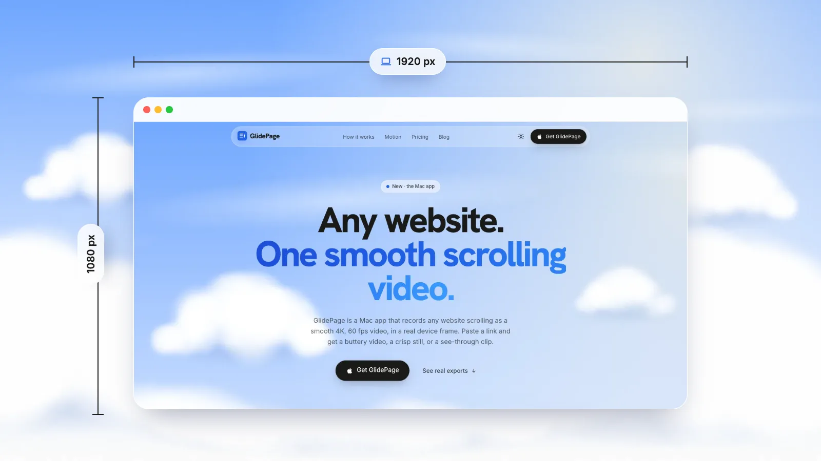
macOS has no box for typing a window size, but AppleScript can set one: in Script Editor, run tell application "Safari" to set bounds of front window to {0, 100, 960, 720}, where the four numbers are the left, top, right and bottom edges in points. On a Retina Mac every point is two pixels across, so a 1920 × 1080-pixel recording needs a page area of 960 × 540 points; Chrome's device toolbar and Safari's Responsive Design Mode can set that viewport exactly. Then record only that area with Shift-Command-5 and Record Selected Portion. GlidePage, a Mac app for Apple Silicon, skips the window entirely: type a custom size such as 1920 × 1080 and it renders the page at 2× and exports 3840 × 2160.
On this page
- Window, viewport and video: three different sizes
- Points and pixels: why a 1920 window records at 3840
- Common recording sizes and the viewport each needs
- Method 1: set the window with AppleScript (Safari and Chrome)
- Method 2: set the viewport directly in Chrome or Safari
- Record exactly that area
- Recording 16:9 on a MacBook without black bars
- GlidePage: type the size, skip the window
- Quick fixes
You want a 1920 × 1080 recording of a website: a clean 16:9 clip for a video, a slide or a product demo. So you try to make the browser window 1920 × 1080, and three things go wrong. macOS has no box to type a window size into. The tabs and toolbar take part of the height, so the page is smaller than the window. And when you finally record it, the file comes out 3840 pixels wide, or the window does not fit on your MacBook screen at all.
It comes down to three different sizes and one doubling. This guide sorts them out, then shows exact, repeatable ways to size Safari and Chrome, set a precise viewport and record just that area.
Window, viewport and video: three different sizes#
When someone says "make it 1920 × 1080", they could mean any of these:
- Window size is the whole browser window: tabs, address bar, toolbar and page. This is what AppleScript sets.
- Viewport size is the part that shows the web page. It is what the site's layout responds to, and what you actually want in the video. It is shorter than the window by the height of the tab bar and toolbar, and that height changes with your settings, such as the tab layout or a bookmarks bar. In the browser console,
innerWidthandinnerHeightreport it. - Video size is the pixel size of the recording. On a Retina Mac, it is twice the viewport in each direction.
For a recording, the number that matters is almost always the video size, so work backwards from it: video, then viewport, then window.
Points and pixels: why a 1920 window records at 3840#
macOS measures the screen in points, not pixels. Apple's high-resolution guidelines explain that a Retina (high-resolution) display has four pixels for every point: two across and two down. Window sizes, AppleScript bounds and the viewport sizes Safari and Chrome report are all in points. (The web calls them CSS pixels; at 100% zoom, one CSS pixel is one point.) A screen recording, though, captures real pixels.
So on any Retina Mac:
- A window 1920 points wide records 3840 pixels wide.
- A 1920 × 1080-pixel recording needs an area of 960 × 540 points.
- The page reports a device pixel ratio of 2, which is also why screenshots come out at double size.
It holds at every resolution option in Displays settings, because the Mac still draws at 2× whatever size you choose. Record a 960 × 540-point area on a MacBook's built-in screen and you get a 1920 × 1080 file. Record the same area on a standard 1× external monitor and you get 960 × 540, because there one point is one pixel.
The catch for websites
A site lays itself out for the viewport in points. A 960-point viewport is narrow enough that many sites switch to their tablet design. You have three ways around it:
- Record a 1280 × 720-point viewport. It records at 2560 × 1440, shows the desktop layout of most sites, and scales down to a sharp 1080p in any video editor.
- Zoom the page out to 50% inside a 960 × 540 viewport. Page zoom changes the size of a CSS pixel (and with it the device pixel ratio), so at 50% on a Retina screen the site lays out as if it were 1920 wide and draws one screen pixel per CSS pixel. The result looks like a recording from a 1080p monitor: the right layout, but not Retina-sharp.
- Use a bigger display. A 1920 × 1080-point viewport plus toolbar is wider than MacBook screens at their usual settings.
Common recording sizes and the viewport each needs#
| Video you want | Shape | Viewport on a Retina screen (points) | Viewport on a 1× screen | Layout width the site sees at 100% |
|---|---|---|---|---|
| 1920 × 1080 (1080p) | 16:9 | 960 × 540 | 1920 × 1080 | 960 on Retina, often a tablet layout |
| 2560 × 1440 (1440p) | 16:9 | 1280 × 720 | 2560 × 1440 | 1280, the desktop layout on most sites |
| 3840 × 2160 (4K) | 16:9 | 1920 × 1080 | 3840 × 2160 | 1920 |
| 1080 × 1920 (vertical) | 9:16 | 540 × 960 | 1080 × 1920 | 540, a phone layout |
| 1080 × 1080 (square) | 1:1 | 540 × 540 | 1080 × 1080 | 540 |
Remember that the window is the viewport plus the toolbar, and macOS keeps windows below the menu bar. A vertical 540 × 960-point viewport needs well over 1,000 points of height once the toolbar is added, which is taller than many laptop screens. For why 4K and 60 fps matter in the first place, see 4K 60fps website videos.
Method 1: set the window with AppleScript (Safari and Chrome)#
AppleScript can set any Safari or Chrome window to exact bounds. It comes with every Mac, and you run it from Script Editor.
1. Open Script Editor
It is in Applications, then Utilities. Create a new document.
2. Read the current bounds
Type this and click Run:
tell application "Safari" to get bounds of front window
Script Editor shows four numbers, such as {0, 30, 1440, 900}. They are not a width and a height but the window's left, top, right and bottom edges, in points, measured from the top-left corner of your main display. Width is right minus left; height is bottom minus top. With a second display, its windows simply have larger (or negative) numbers, because every display shares the main display's coordinates.
For Chrome, write "Google Chrome" instead of "Safari". The first time, macOS may ask whether Script Editor can control the browser: allow it. If you see "Can't get window 1", the browser has no window open.
3. Set the new bounds
Say you want a 960 × 540-point viewport, for a 1920 × 1080 recording on a Retina screen. Start with a window 960 points wide and 540 points plus a guess for the toolbar (say 80) tall:
- left = 100, top = 100
- right = 100 + 960 = 1060
- bottom = 100 + 540 + 80 = 720
tell application "Safari" to set bounds of front window to {100, 100, 1060, 720}
Keep the top edge below the menu bar. A window can run off the side of the screen, but macOS will not let it sit under the menu bar or grow taller than the screen, so a size that does not fit gets trimmed.
4. Measure the viewport and correct the height
Open the browser's console and type innerWidth + " x " + innerHeight. In Safari, the Develop menu has to be on first: Safari, Settings, Advanced, then Show features for web developers.
Undock the developer tools first, or they take space from the page: in Chrome, choose Undock into separate window from the Customize and control DevTools menu; in Safari, click the button in Web Inspector's tab bar that detaches it into its own window.
If the console says 960 x 552, the toolbar is 12 points shorter than the guess: subtract 12 from the bottom (720 becomes 708) and run the script again. When it reads 960 x 540, save the script. It restores the exact size in one click next time, as long as your toolbar layout does not change.
With those numbers, the page area sits at x 100 to 1060 and y 168 to 708: the bottom 540 points of the window, unless a status bar or find bar is showing. You will use that in the recording step.
Method 2: set the viewport directly in Chrome or Safari#
If you only care about the page area, both browsers can set it exactly, whatever the window size.
Chrome: the device toolbar
- Open DevTools and click Toggle device toolbar at the top of the panel.
- Choose Responsive from the device list above the page, then type the width and height into the boxes, such as 960 and 540, or 1280 and 720.
- Check the zoom menu in the same toolbar. At 100%, every CSS pixel is a point on screen. At a lower zoom, the viewport is shrunk to fit and you would record fewer pixels, so make the window larger or undock DevTools.
Leave the device pixel ratio at its default for a screen recording: what you record is your screen, at your screen's density.
Safari: Responsive Design Mode
- Choose Develop → Enter Responsive Design Mode (Control-Command-R).
- Click the width or height above the page and type the new value. Safari shows this size in screen points, which is exactly the number in the table above.
- Watch the zoom percentage. At 100%, every pixel of the page is on screen. A viewport larger than the window lowers the zoom and loses detail, so enlarge the window if it drops.
Both modes add a little toolbar above the page, so record just the viewport, not the whole window.
Record exactly that area#
With the Screenshot toolbar
- Press Shift-Command-5.
- Choose Record Selected Portion and drag the borders of the selection to the edges of the page area.
- Click Record, scroll, then click the Stop button in the menu bar or press Command-Control-Esc. The recording is saved to your desktop as a MOV file.
Dragging by hand is rarely exact, so crop any stray edge in your video editor.
With one Terminal command, exact to the point
macOS also includes screencapture, the command-line version of the same tool. Its -R option takes a rectangle as x, y, width and height, in the same points as the AppleScript bounds, and -V records video for a set number of seconds. For the page area from Method 1:
screencapture -V 20 -R 100,168,960,540 ~/Desktop/page.mov
That records exactly the 960 × 540-point viewport for 20 seconds, which on a Retina screen is a 1920 × 1080 file. Type man screencapture to see the options. Its own manual page admits it is "not very well documented", so try a short clip first. macOS may ask you to allow Terminal to record the screen.
Either way, you still scroll by hand while it records. How to record a scrolling screen on Mac covers how to get the smoothest result from a hand scroll.
Recording 16:9 on a MacBook without black bars#
MacBook screens are taller than 16:9, closer to 16:10, with the menu bar (and on newer models the camera notch) along the top. Record the full screen and the video has the screen's shape. Put it in a 16:9 timeline or slide and you get bars at the sides, or you crop off the top and bottom.
The fix is to record a 16:9 area instead of the whole screen:
- Size the viewport to 16:9 with any row of the table above, such as 1280 × 720 points.
- Record only the viewport, with Record Selected Portion or
screencapture -R. - Do not stretch it to fit. Stretching distorts text; if the shape is wrong, re-record rather than scale.
If the video is going to a feed, check the platform's current limits before you export. Website videos for LinkedIn and X lists them.
GlidePage: type the size, skip the window#
GlidePage is a Mac app that turns a web page into a smooth scrolling video or a sharp still, and it never uses a browser window on your screen. It opens the page in its own built-in browser and records every frame one at a time, so your display size, the toolbar and the Retina arithmetic stop mattering:
- Any custom size. Type any size from 320 to 3840 px per side. A 1920 × 1080 custom size lays the page out at 1920 wide (the desktop layout), renders it at 2× and exports 3840 × 2160 unframed: a 4K file on a MacBook screen that could never show a 1920-point window.
- A 16:9 canvas. On a background, choose the aspect ratio: Auto follows the device, or pick 16:9, 9:16, 1:1, 4:5 or 4:3. A desktop video in a frame or on a background is 3840 × 2160.
- 1080p when you want it. The HD export gives 1920 × 1080 for desktop and records noticeably faster.
- Real devices. MacBooks, iMac, Studio Display, current iPhones, iPads and more. Phone sizes load the mobile layout; a framed phone video is 2160 × 3840.
- Page zoom from 50% to 200%. It works like browser zoom: the layout reflows and the output resolution stays the same, which is the 50% trick above without the arithmetic.
- Smooth by construction. Frames are captured one at a time on a controlled clock, at 60 fps, so the scroll is smooth however fast your Mac is. Cookie banners are hidden by default.
It runs on Apple Silicon Macs with macOS 12 or later, uploads nothing, and can record pages behind a login once you sign in with Take control. For the complete workflow, see how to make a scrolling video of a website.
Quick fixes#
| Problem | Why it happens | Fix |
|---|---|---|
| The recording is twice the size you expected | Retina screens have two pixels per point | Record half the size in points, or scale down on export |
| The page is shorter than the window | The tab bar and toolbar take part of the height | Measure innerHeight and add the difference to the bottom edge |
| The site shows its tablet layout | The viewport is too narrow in points | Use 1280 × 720 points, or zoom the page to 50% |
| The window will not get taller | Windows must fit below the menu bar | Use a smaller size or a larger display |
| Black bars at the sides of the video | The full screen, which is taller than 16:9, was recorded | Record a 16:9 area only |
If you need stills rather than video, high-resolution website screenshots covers the same points-and-pixels problem for images.
Sources
- Apple Developer: High Resolution Explained (points and pixels) (checked September 2026)
- Mac OS X Automation: AppleScript tutorial, the bounds property (checked September 2026)
- Chrome for Developers: Simulate mobile devices with device mode (checked September 2026)
- Apple Developer: Responsive Design Mode (Safari) (checked September 2026)
- MDN: Window.devicePixelRatio (checked September 2026)
- Apple Support: How to record the screen on Mac (checked September 2026)



Make your site move.
Any page, one smooth 4K video. Framed, on any background, or transparent.
Questions, answered
Why is my 1920-pixel browser window recorded at 3840 pixels?
Window sizes on a Mac are measured in points, and a Retina display has two pixels per point in each direction. A screen recording captures real pixels, so a window 1920 points wide becomes a video 3840 pixels wide. For a 1920 × 1080 recording, record an area of 960 × 540 points.
How do I set a Chrome window to exactly 1920 × 1080 on a Mac?
Open Script Editor and run: tell application "Google Chrome" to set bounds of front window to {0, 100, 1920, 1180}. That makes the window 1920 by 1080 points, but the page area will be shorter by the height of the toolbar. It also has to fit on your screen, which rules out most laptop displays, and on a Retina screen it records at 3840 × 2160.
What is the difference between window size and viewport size?
The window size includes the tabs, address bar and toolbar. The viewport is only the area that shows the web page, and it is what the site lays itself out for. Type innerWidth and innerHeight in the browser console to see the viewport size.
How do I screen record in 16:9 on a MacBook?
Press Shift-Command-5, choose Record Selected Portion and drag a 16:9 area, such as a browser viewport set to 1280 × 720 points. MacBook screens are taller than 16:9, so a full-screen recording ends up with bars or cropping in a 16:9 video.
Why does AppleScript set bounds use four numbers instead of a width and height?
Bounds describe a rectangle by its edges: left, top, right and bottom, in points from the top-left corner of the main display. To set a width and height, make right equal to left plus the width, and bottom equal to top plus the height.
Can I set an exact viewport size without resizing the window?
Yes. In Chrome, turn on the device toolbar in DevTools, choose Responsive and type a width and height. In Safari, choose Enter Responsive Design Mode from the Develop menu and click the size to type new values. Keep the zoom at 100 percent so nothing is scaled down on screen.