To make a Framer mockup video, record the published site at a real device size so Framer serves the matching breakpoint, then place the recording in a device frame on a background. For free, use Safari's Responsive Design Mode to get the Phone breakpoint, record the viewport with Shift-Command-5 and frame it in Keynote. GlidePage, a Mac app for Apple Silicon, does it in one step: it loads the page with a real phone user agent and viewport, scrolls it inside an accurate iPhone, Pixel, Galaxy, MacBook or Safari window frame, and exports a 4K MP4, or a transparent ProRes 4444 or WebM for your own landing page.
On this page
A Framer template sells on how it looks, and buyers want to see it where their own visitors will: on a phone, on a laptop, in a browser. A mockup video does that in a few seconds. The published site scrolls inside an iPhone, a MacBook or a Safari window, on a background that suits your listing or feed.
The frame is the easy part. The part most mockups get wrong is the page inside it. This guide covers why the Phone breakpoint decides whether a mockup is honest, which frame suits which place, the free way to make one on a Mac, a one-step way with GlidePage, and transparent versions for your own storefront.
Why the Phone breakpoint decides the mockup#
Framer builds responsive sites from breakpoints. According to Framer Academy, the width shown on the canvas for each breakpoint "is also the minimum viewport width at which that breakpoint becomes active", and Framer uses those ranges to choose the layout in the browser. So the Phone layout appears only when the page is opened at a phone-narrow viewport.
That is why the most common mockup shortcut fails. Record the site in a wide desktop window, shrink the video into a phone frame, and viewers see the Desktop breakpoint at a fraction of its size: several columns side by side, a desktop navigation bar, text too small to read. Anyone who opens the template on their own phone knows it does not look like that.
For a template, the Phone breakpoint is also the part buyers often skip in a quick click through the live preview on a laptop. Showing it properly is a selling point. Framer's own template best practices ask that "Preview images accurately represent the template" and that "Layouts adapt cleanly across mobile, tablet, and desktop breakpoints". A mockup of the real Phone layout does both.
Which frame for which place#
Pick the frame for where the video is going, not the other way round:
| Where it goes | Frame | Shape |
|---|---|---|
| Framer Community post or template listing | MacBook or Safari window for the desktop, an iPhone for the phone version | 16:9, or the device's own shape |
| X and LinkedIn | A MacBook on a background, or an iPhone on a wide or square background | 16:9 or 1:1 |
| Reels, TikTok and Stories | iPhone, Pixel or Galaxy | 9:16 |
| Dribbble, Behance and portfolios | Safari window or MacBook, with a phone version alongside | 4:3 or 16:9 |
| Your own storefront hero | A transparent iPhone or MacBook | The device's own shape |
| A client handoff | A Safari window showing their domain | 16:9 |
For a general audience, a current iPhone is the safe default. If the template targets an Android-first market, a Pixel or Galaxy frame says so at a glance.
The free way: emulate a phone, record, then frame it#
You can make a decent phone mockup with what is already on your Mac. It takes three stages.
1. Get the Phone layout in your browser
In Safari: turn on the Develop menu in Safari's Advanced settings, open your published site, and choose Develop → Enter Responsive Design Mode. Click a phone at the top of the page to use its size. Pop-up menus let you set the device pixel ratio and the user agent, which is the browser and device information the site receives.
In Chrome: open DevTools, click Toggle device toolbar, and choose a phone from the Dimensions list. Chrome describes device mode as "a first-order approximation" of a real phone, which is fine for a mockup, where the layout is what matters.
Reload after switching, then check that you are looking at the Phone breakpoint: the mobile navigation, stacked sections and phone-sized type.
2. Load the page and record the viewport
Scroll to the bottom so images and fonts load, then back to the top. Press Shift-Command-5, choose Record Selected Portion, and drag the frame tightly around the emulated phone screen. Record one long, slow trackpad swipe, then stop from the menu bar. Exporting a Framer website as video has the full recording routine, including a constant-speed scroll script.
3. Put it in a frame
Place the recording behind a phone frame image in Keynote or a video editor, mask its corners to match the screen, and export. Adding an iPhone frame to a screen recording walks through the sizes, the rounded corners and the free Keynote method step by step.
What the free way leaves to you
- The status bar. An emulated viewport has none, so you either leave the top of the screen empty or paste in a fake bar, and it rarely matches the hero's colour.
- The top of the screen. Your hero has to clear the Dynamic Island or notch, and you have to line that up by hand.
- The scroll. It is still a live recording by hand, with dropped frames and uneven speed.
- Sharpness. A phone-sized viewport is small on your display, so the recording is small too, and it softens when scaled up into a large frame.
Making it with GlidePage#
GlidePage is a Mac app that turns a link into a framed scrolling video, and device mockups are where it saves the most steps. It records the live page frame by frame, so the scroll is perfectly smooth, and it runs entirely on your Mac.
1. Paste the published URL
Use the framer.app address, a free Framer subdomain, your custom domain or a staging link. Nothing is added to your Framer project. Common cookie banners are hidden by default, and a demo popup or promo bar can be closed in Take control or removed with Hide element.
2. Pick a phone
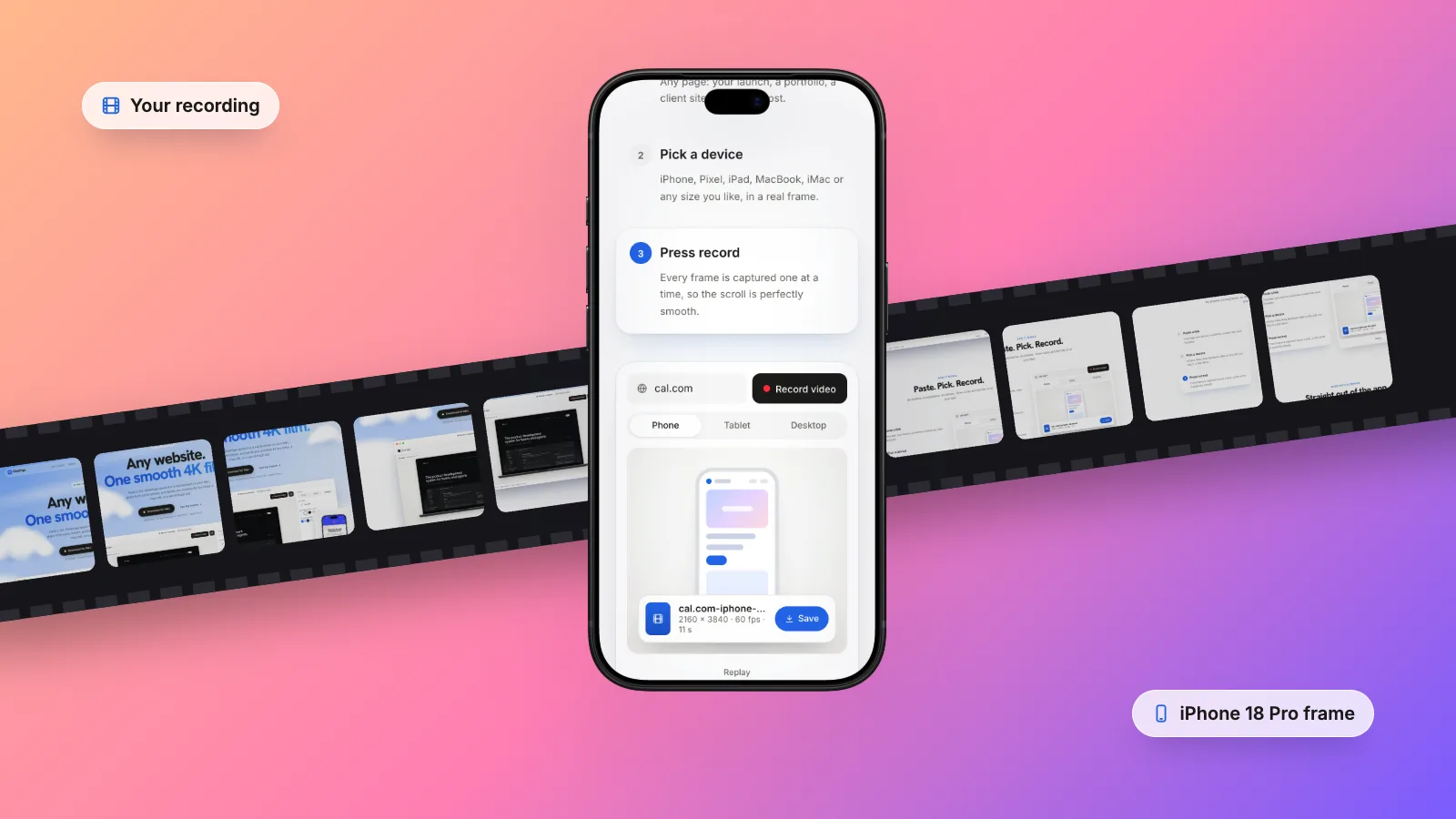
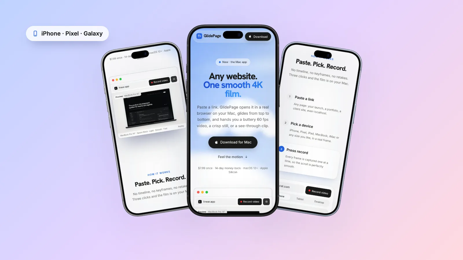
Current iPhones (including iPhone 18 Pro and Pro Max, iPhone Air and the 17 and 16 series), Google Pixel and Samsung Galaxy phones, in their real colours. The page loads with a real phone user agent and viewport, so Framer serves your actual Phone breakpoint, not a shrunken desktop.
Tablets work the same way, with iPad Pro, Air and mini frames and Android tablets. Which breakpoint a tablet gets depends on its width and where your Tablet breakpoint starts, so check the preview.
3. Set the status bar
Frames include the status bar, the Dynamic Island or notch placement, and safe areas, so the hero does not hide under them. The status bar colour has five choices:
- Auto uses the page's own top colour, so the bar looks like part of the site.
- Blur lets the page's top edge glow up into the bar, easing as the colours change while it scrolls. It suits a hero photo or gradient.
- White, Black or any solid colour, for a fixed look.
The clock and icons turn black or white to match.
4. Or show the desktop
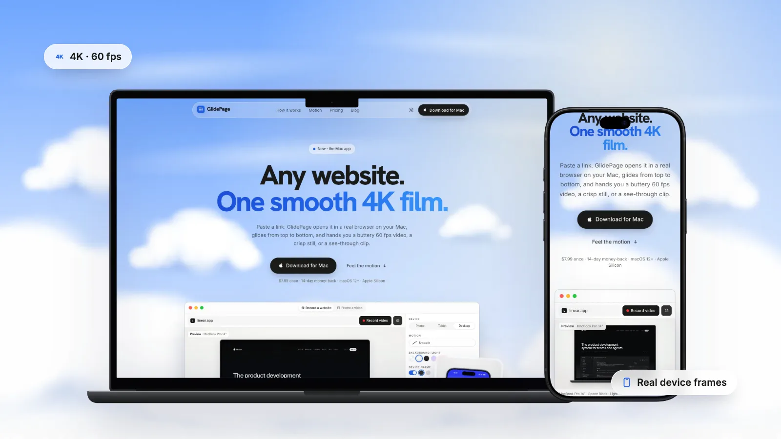
For the Desktop breakpoint, choose a MacBook Air, MacBook Pro, iMac, Studio Display or a Windows laptop frame, or a Safari window: a drawn macOS Safari window with the traffic lights and the site's host in the address bar, light or dark to match the page theme. It works as its own device or around any custom size from 320 to 2560 pixels a side.
5. Choose the background, motion and size
Set a solid colour, a gradient, a blurred copy of the page or an animated material, with an optional soft shadow. Pick one of six motion curves and a speed, and add up to ten pauses on the sections that sell. A framed phone on a background exports at 2160 × 3840 and a framed desktop at 3840 × 2160, or choose 16:9, 9:16, 1:1, 4:5 or 4:3.
If your template has a dark theme, Framer colour styles can follow the visitor's device appearance. GlidePage's page theme sets that preference for the recording, so you can record a light and a dark version back to back.
For a sense of timing, a 31.4-second iPhone 18 Pro recording at 4K and 60 fps took about 5.5 minutes on a MacBook Air with an M4 chip and came out at 71.0 MB.
Transparent mockups for your own storefront hero#
Many creators also sell from their own site, and a device floating over the hero, with no box around it, looks far better than a video on a coloured rectangle. In GlidePage, turn the frame on and set the background to None, and the export is transparent:
- ProRes 4444 MOV with alpha, for Final Cut Pro, Premiere Pro, DaVinci Resolve and After Effects. It is large: roughly 40 MB per second of 4K, 60 fps video.
- VP9 WebM with alpha, for websites, converted on request at 4K. It plays transparent in Chrome, Edge and Firefox. Safari plays it without transparency, so for Safari visitors you also need an HEVC-with-alpha copy, which QuickTime Player can make from the MOV.
- A transparent 4K PNG from photo mode, for a poster image or a still for the listing.
Transparent video on a website has the HTML that serves the right file to each browser, and how to make a transparent background video on Mac covers the editor exports. Keep the web copies at the size they will be shown: a phone that appears 400 pixels wide does not need a 4K file.
During the free trial, transparent exports need a license; framed exports on a background work from the first day, with a small watermark.
Desktop and phone in one shot#
A responsive mockup shows the desktop and phone versions together, which proves at a glance that every breakpoint was designed. GlidePage records one device per export, so:
- Record the desktop in a MacBook or Safari window and the phone in an iPhone, with the same background, speed and motion curve.
- Place them in Keynote or a video editor, the laptop larger and the phone overlapping its lower corner.
- Trim both to the same length so they start and finish together.
If you would rather lead with the phone on its own, for Reels or TikTok, phone mockup videos in general covers vertical formats, safe zones and choosing between iPhone, Pixel and Galaxy.
Checklist before you record#
- The Phone breakpoint fills the screen, with no element wider than the viewport.
- You are recording the published URL, on your custom domain if the address will show.
- The status bar colour suits the top of the hero.
- Demo popups, promo bars and cookie banners are closed or hidden.
- Light and dark versions, if the template supports both.
- Reveals you want on camera are set to replay: see recording Framer scroll animations.
- The frame and shape match where the video is going.
For the bigger picture on scrolling videos, speed and motion, see how to make a scrolling video of a website.
Sources
- Framer Academy: Creating breakpoints in Framer (checked October 2026)
- Framer Help: Why is my site not filling the screen on the Phone breakpoint? (checked October 2026)
- Framer Help: Template best practices (checked October 2026)
- Framer Academy: Light and dark mode (checked October 2026)
- Safari Developer Help: Responsive Design Mode (checked October 2026)
- Chrome DevTools: Simulate mobile devices with device mode (checked October 2026)




Make your site move.
Any page, one smooth 4K video. Framed, on any background, or transparent. Free for 7 days, no card needed.
Questions, answered
How do I show my Framer site on an iPhone in a video?
Open the published site at a phone viewport, record it scrolling, and place the recording in an iPhone frame. For free, use Safari's Responsive Design Mode, record with Shift-Command-5 and frame it in Keynote. GlidePage does all of it in one step and exports a 4K video.
Why does my Framer site show the desktop layout in a phone mockup?
Because it was recorded in a wide window and shrunk. Framer picks the breakpoint from the viewport width, so the Phone layout only appears at a phone-narrow viewport. Record at a real phone size and user agent and the mockup shows the layout visitors actually get.
Can I put my Framer site in a Safari window frame?
Yes. You can screen record the real Safari window, or use GlidePage's drawn Safari window frame, which shows the traffic lights and the site's host in the address bar, in light or dark to match the page. Record your custom domain if you want it in the address bar.
Can I get a transparent Framer mockup for my own website?
Yes. With the device frame on and no background, GlidePage exports a ProRes 4444 MOV with alpha for editors or a VP9 WebM with alpha for the web. The WebM is transparent in Chrome, Edge and Firefox; for Safari, make an HEVC-with-alpha copy of the MOV in QuickTime Player.
Which device should a Framer template mockup use?
Show both breakpoints buyers care about: the desktop in a MacBook or Safari window, and the phone in a current iPhone. Use a Pixel or Galaxy frame if the template targets Android-first markets.
Can a mockup show my Framer site in dark mode?
Yes, if the site uses colour styles with dark values set to follow the device appearance. Switch your Mac's appearance to dark before a hand recording, or set the page theme to dark in GlidePage.