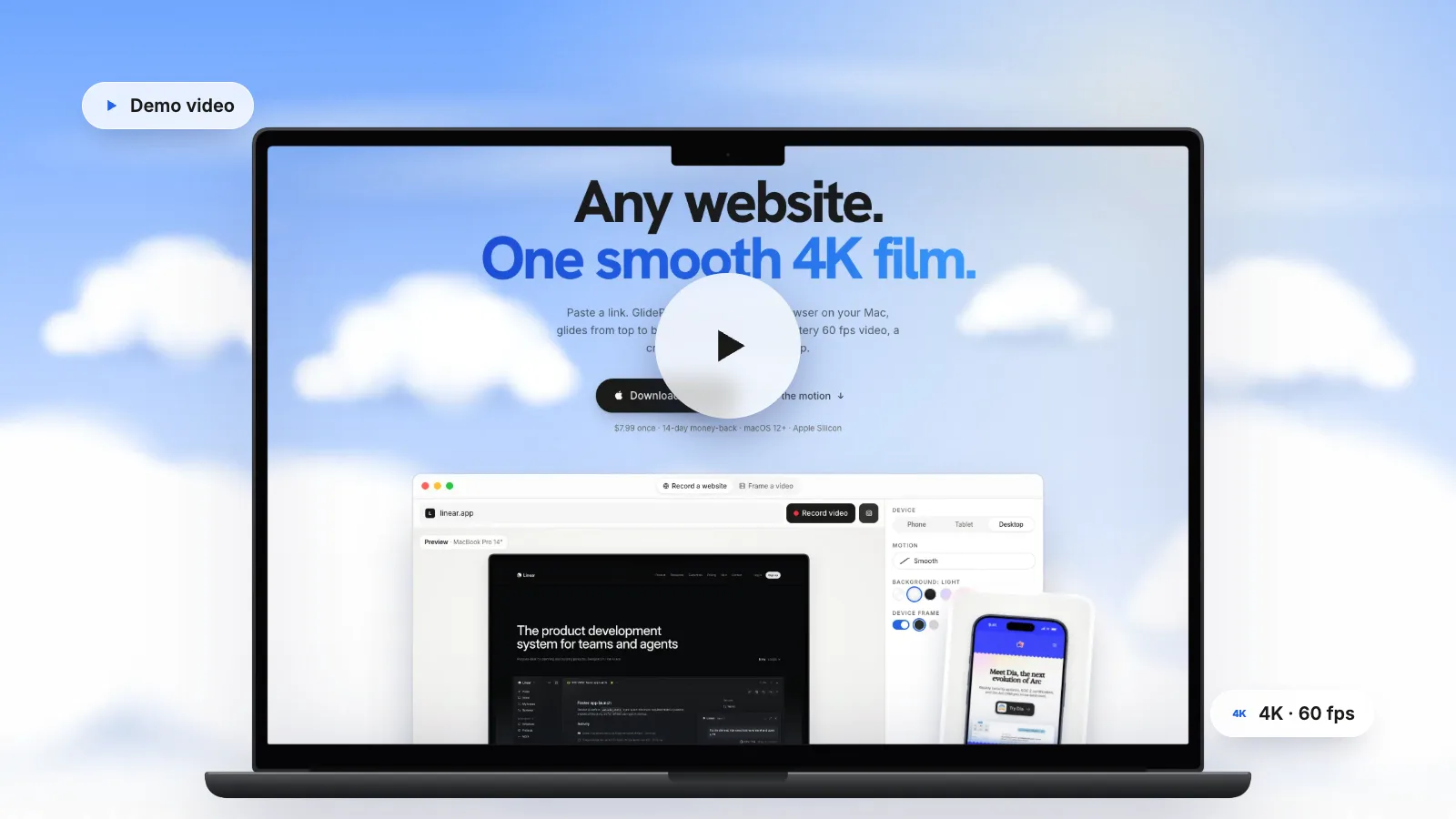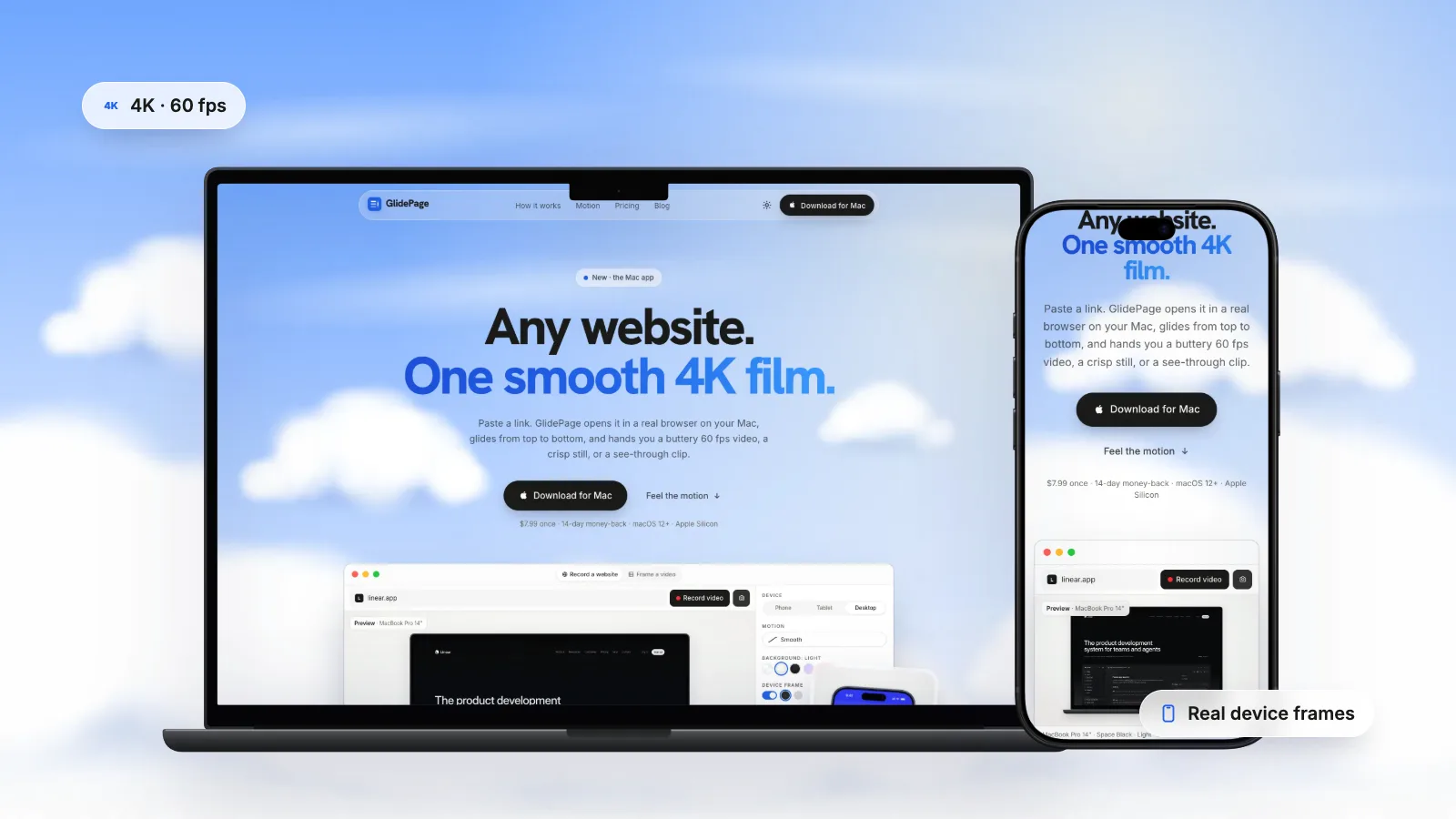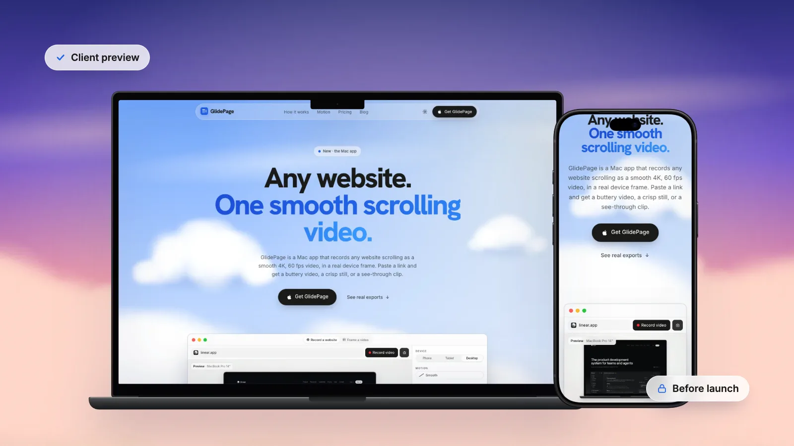
To present a website to a client, share it before launch on a staging or preview URL (or from your own machine on a call), then walk them through it live: restate the goals, follow the main visitor journey, show the mobile version early, cover the key pages and name the content gaps. Ask questions that tie feedback to the goals rather than to taste. Afterwards, send a short recap with a desktop loop, a phone loop and numbered stills of each section, so people in other time zones can review on their own time. You can make the recap by hand with your Mac's screen recorder and screenshots, or with GlidePage, a Mac app for Apple Silicon that records staging and localhost sites as framed 4K videos without uploading them.
On this page
- Present live, send a link, or both?
- How to show a client a website before it is live
- Prepare before the meeting
- A structure for the presentation
- Show desktop and mobile side by side
- Steer feedback from taste to goals
- Send a recap people can review on their own time
- Making the recap with GlidePage
- After approval: the handoff checklist
You have built the site. It works on staging, most of the content is in, and now the client needs to see it. How you show it matters almost as much as what you show: a clear presentation gets you decisions, a loose one gets you a long list of scattered opinions.
This guide covers sharing a site before it is live, a structure for the meeting, showing desktop and mobile together, steering feedback toward the goals, a recap people can review later, and the handoff.
Present live, send a link, or both?#
There are three ways to put a site in front of a client, and each does a different job.
| Approach | Good for | Watch out for |
|---|---|---|
| A live walkthrough on a call | The first reveal, explaining decisions, answering questions as they come up | Time zones, and one person doing all the talking |
| A preview link to click through alone | Detailed review, checking copy, testing on their own devices | No context, so feedback drifts toward taste |
| A recorded recap (videos and stills) | People who missed the call, review across time zones, a record of what was shown | It cannot answer questions, so pair it with a note |
The pattern that works for most projects: present the first version live, then send the preview link and a short recap straight after the call. The call gives context, the link lets them explore, and the recap keeps everyone on the same version.
Avoid sending a bare link as the first look. Without the goals in front of them, people react to what is easiest to react to: colours, photos and fonts.
How to show a client a website before it is live#
The site has to be reachable from wherever the client is. You have four options.
A staging or preview URL
Many hosting platforms can deploy a preview build to its own address. It behaves like the real site, works on the client's phone, and stays up between meetings. Keep it out of search results: Google's documentation says a noindex rule tells Google not to show a page in its results, and for anything confidential, Google's advice is to password-protect it.
A password-protected preview
Many hosts can put a password on a preview. The simplest form is HTTP basic authentication: the server answers with a 401 status and the browser shows a username and password prompt. MDN notes that basic auth only base64-encodes the credentials, which anyone can reverse, so use it over HTTPS only.
One common mistake: sending a link with the password written into it, like https://user:pass@staging.example.com. MDN says modern browsers no longer allow that syntax and strip the username and password before the request is sent, so the client just sees the prompt. Send the link and the password separately.
A tunnel to your machine
A tunnelling service gives a site running on your laptop a temporary public address. It is quick for a one-off review, but the site is public while the tunnel is open, and dev servers are not built to face the internet. How to record a localhost website covers the risks and a safer setup.
Your own machine, on a call
For an early build, share your screen on a video call and click through the site from localhost. Nothing leaves your Mac, and the client sees exactly what you see. The catch: they cannot explore it afterwards, which is where a recorded recap helps.
Presenting a mockup instead of a built site
At the mockup stage, the same structure applies. Show the screens inside a device frame, desktop and phone together, and say clearly that nothing is clickable yet, so feedback stays on content and layout.
Prepare before the meeting#
- Write down the goals you agreed at the start: who the site is for, what visitors should do, and how you will know it works. You will open the meeting with them.
- Fill in real content where you can. Where you cannot, use clearly marked placeholders ("Case study copy to come"), not lorem ipsum, which reads as unfinished work.
- List the known gaps: missing photos, unbuilt pages, integrations still to connect. Name them first so nobody reports them back as problems.
- Check the site on a real phone, not just a narrow browser window.
- Clear the clutter: dismiss the cookie banner, close other tabs, and turn on a Focus mode so notifications stay quiet while you share your screen.
- Decide what you need from them: approval of the home page, a choice between two directions, or content by a date.
A structure for the presentation#
Keep the order the same for every review, so clients learn what to expect and you do not forget a step.
1. Restate the goals
Start with the brief, not the site. Two or three sentences: who the site is for, the one thing visitors should do, and what was wrong with the old one. Everything you show afterwards is measured against this.
2. Walk the main journey
Show the site the way a visitor meets it. Arrive on the home page, scroll it top to bottom without stopping to explain every section, then follow the main path: the service or product page, the pricing, the contact form or checkout. Narrate briefly: "A first-time visitor lands here, reads this, and clicks through to this."
3. Show mobile early
Do not save the phone version for the last five minutes, when everyone is tired. The phone layout is where a design makes its hardest trade-offs: stacked sections, a collapsed menu, shorter headlines, buttons that move. Show it straight after the main journey, while attention is high.
4. Walk through the key pages
Pick the templates that matter: a service page, a case study, the blog post layout, the contact page. For each one, say what decision it reflects, for example: "The pricing table leads with the plan most customers choose, because that is what people ask about first."
5. Name the content gaps and next steps
End with what is not done yet and who owns it: "We need the team photos by the 14th; the case study copy is with you." Then agree on the feedback round: how it will arrive, by when, and from whom.
Show desktop and mobile side by side#
Clients understand a responsive site faster when they see both layouts at once. Three ways to do it on a Mac:
- Safari's Responsive Design Mode. Choose Develop → Enter Responsive Design Mode (turn on the Develop menu in Safari's Advanced settings first), then click a device at the top of the page. Click it again to switch between portrait and landscape.
- Chrome's device mode. Open DevTools and press Command-Shift-M to toggle the device toolbar, then pick a device from the Dimensions menu. Google calls it a first-order approximation: it simulates a phone on your laptop, so check the real thing too.
- Two recorded loops. A desktop scroll in a laptop frame next to the same page scrolling on a phone, placed side by side on a slide or in one message. It shows the real mobile layout, runs by itself while you talk, and does not depend on the meeting Wi-Fi. Mobile website mockup videos covers how to capture the true mobile version.
If you present from a deck, showing a website in a presentation covers adding those loops to Keynote, PowerPoint or Google Slides so they play by themselves.
Steer feedback from taste to goals#
"I don't love the blue" is a real reaction, and it deserves an answer. But if every comment is about taste, you end up redesigning by committee. The fix is in the questions you ask.
Ask questions that point back to the goals:
- "Would a first-time visitor know what you do from the first screen?"
- "Is there anything on the home page your customers would not care about?"
- "Is anything missing that customers ask about on sales calls?"
- "Does the path from the home page to the contact form feel short enough?"
- "Which section would you show a new customer first?"
- "Is there anything here you could not sign off on, and why?"
When a taste comment comes up, translate it rather than argue with it:
| What they say | What to ask | What you learn |
|---|---|---|
| "I don't like the blue" | "What should the colour make visitors feel?" | Whether it is a brand issue or a personal preference |
| "It feels empty" | "Which section feels like it is missing information?" | A content gap, not a layout problem |
| "Make the logo bigger" | "Is the worry that people will not know whose site this is?" | Whether brand recognition is really at risk |
| "Can we add a slider?" | "What do you want visitors to see that they might miss?" | The content that needs a better place |
Ask for feedback as one consolidated list, from one person, by a date. Scattered comments from five people in three channels are how projects lose a week.
Send a recap people can review on their own time#
A recap turns a one-hour meeting into something the client's whole team can review in their own time zone. It also records which version everyone saw, which helps when a comment arrives two weeks later about something that has since changed.
A good recap is short enough to read on a phone:
- A short written note. Two or three lines on the goals, what changed since last time, and the decisions you need.
- A desktop loop. The home page scrolling in a laptop frame, 15 to 30 seconds.
- A phone loop. The same page on a phone, showing the real mobile layout.
- Numbered stills of each key section. One image per section or template, labelled "1. Hero", "2. Services" and so on, so feedback can say "on 3, the second paragraph" instead of "the bit near the middle".
- The preview link and the deadline. Where to look, and when you need the consolidated feedback.
The videos and stills open on any phone, with no password to manage, which is often all a busy stakeholder will look at.
You can make all of this by hand. Record each scroll with the Screenshot toolbar (Shift-Command-5, then record a portion of the screen), use Responsive Design Mode for the phone version, and take stills with Shift-Command-4. Click the floating thumbnail after a screenshot to mark it up, which is handy for circling what changed. How to make a scrolling video of a website covers how to make the scroll itself look smooth. If the client needs a narrated tour rather than silent loops, website demo videos covers recording a walkthrough with your voice.
Making the recap with GlidePage#
The recap is the step most people skip, because clean scrolls by hand take several takes per page. GlidePage, a Mac app, turns a link into a smooth, framed 4K video in one step, and suits pre-launch work:
- It records sites that are not public. Staging sites, LAN addresses, .local hosts and localhost, such as a dev server on localhost:3000.
- Nothing is uploaded. Pages, videos and stills stay on your Mac, and no account is needed, which matters when the site is a client's unreleased work.
- The phone version is the real one. Phone sizes load the site with a real phone user agent and viewport, so the recap shows the actual mobile layout, in a frame for a current iPhone, Pixel or Galaxy.
- Stills come from the same setup. Photo mode saves a 4K PNG from any point on the page, in the same frame and on the same background, which makes the numbered section stills quick.
- Common cookie banners are hidden by default, so they do not cover the hero.
Be clear about what it cannot do. It cannot record a link protected by HTTP basic auth: links with a username and password are refused. For those, open a temporary public preview just for the recording and close it straight after, or record the local build on your Mac. A preview behind an ordinary login form is fine: sign in with Take control first. It also has no narration or captions, so the clips will not explain themselves: pair them with the live call or a short written note. It runs on Apple Silicon Macs with macOS 12 or later.
After approval: the handoff checklist#
Approval starts the handoff. Go through this list before you call the project done:
- Written sign-off. An email confirming which version was approved, with the recap attached as the record.
- Launch settings. Remove the preview password and any noindex rule from the live site. A noindex rule tells Google not to show the page in its results, so one left behind can quietly hide the launch from search.
- Domain and DNS. Who owns the domain, where it is registered, and who can change the records.
- Accounts and access. Hosting, CMS, analytics and email accounts in the client's name, with your own access reduced to what the support agreement covers.
- Forms and integrations. Every form submitted once on the live site, with the messages arriving in the right inbox.
- An editing guide. A short written or recorded guide to updating the pages they will change most often.
- Backups. Where they are, how often they run, and how to restore one.
- Final recordings. A desktop and phone scroll of the launched site, for the client's launch posts and for your own case study. Web design portfolio videos explains why it is worth recording every site on handoff day.
A clear walkthrough, one round of focused feedback, a recap everyone can return to, and a tidy handoff: that is most of what makes a project feel easy to the client.
Sources
- MDN: HTTP authentication (Basic scheme, credentials in the URL) (checked September 2026)
- Google Search Central: Block Search indexing with noindex (checked September 2026)
- Google Search Central: Control what you share with Google (checked September 2026)
- Safari Developer Help: Simulate responsive web content on Apple devices (checked September 2026)
- Chrome DevTools: Simulate mobile devices with device mode (checked September 2026)
- Apple Support: Take screenshots or screen recordings on Mac (checked September 2026)



Make your site move.
Any page, one smooth 4K video. Framed, on any background, or transparent.
Questions, answered
Should I present a website to a client live or just send a link?
Present the first version live, then send the link. On a call you can restate the goals and explain decisions, which keeps feedback focused. Straight afterwards, send the preview link and a short recap so the client can explore and share it with their team.
How do I show a client a website before it is live?
Use a staging or preview URL from your host, ideally password-protected and kept out of search with a noindex rule. For early builds you can share your screen on a call and run the site from your own machine. A tunnel also works for a quick review, but it makes the site public while it is open.
How do I get useful feedback on a website design instead of opinions?
Restate the goals at the start of the meeting and ask questions that point back to them, such as whether a first-time visitor would know what the business does from the first screen. When a taste comment comes up, ask what the client wants visitors to feel or do. Collect feedback as one consolidated list from one person by a set date.
Should I send a recorded video instead of holding a meeting?
Usually both. A live call is best for the first reveal because you can explain decisions and answer questions. A recorded recap with desktop and phone loops and numbered stills works well afterwards, especially for people in other time zones or who missed the call.
How do I show the desktop and mobile versions of a site together?
On a Mac, use Safari's Responsive Design Mode or Chrome's device mode to preview phone sizes, and check on a real phone too. For a presentation or recap, put a desktop scroll in a laptop frame next to the same page scrolling on a phone.
What should a website handoff include?
Written sign-off on the approved version, the preview password and any noindex rule removed at launch, clear ownership of the domain and accounts, tested forms, a short editing guide, backup details, and final recordings of the launched site for the client and your portfolio.