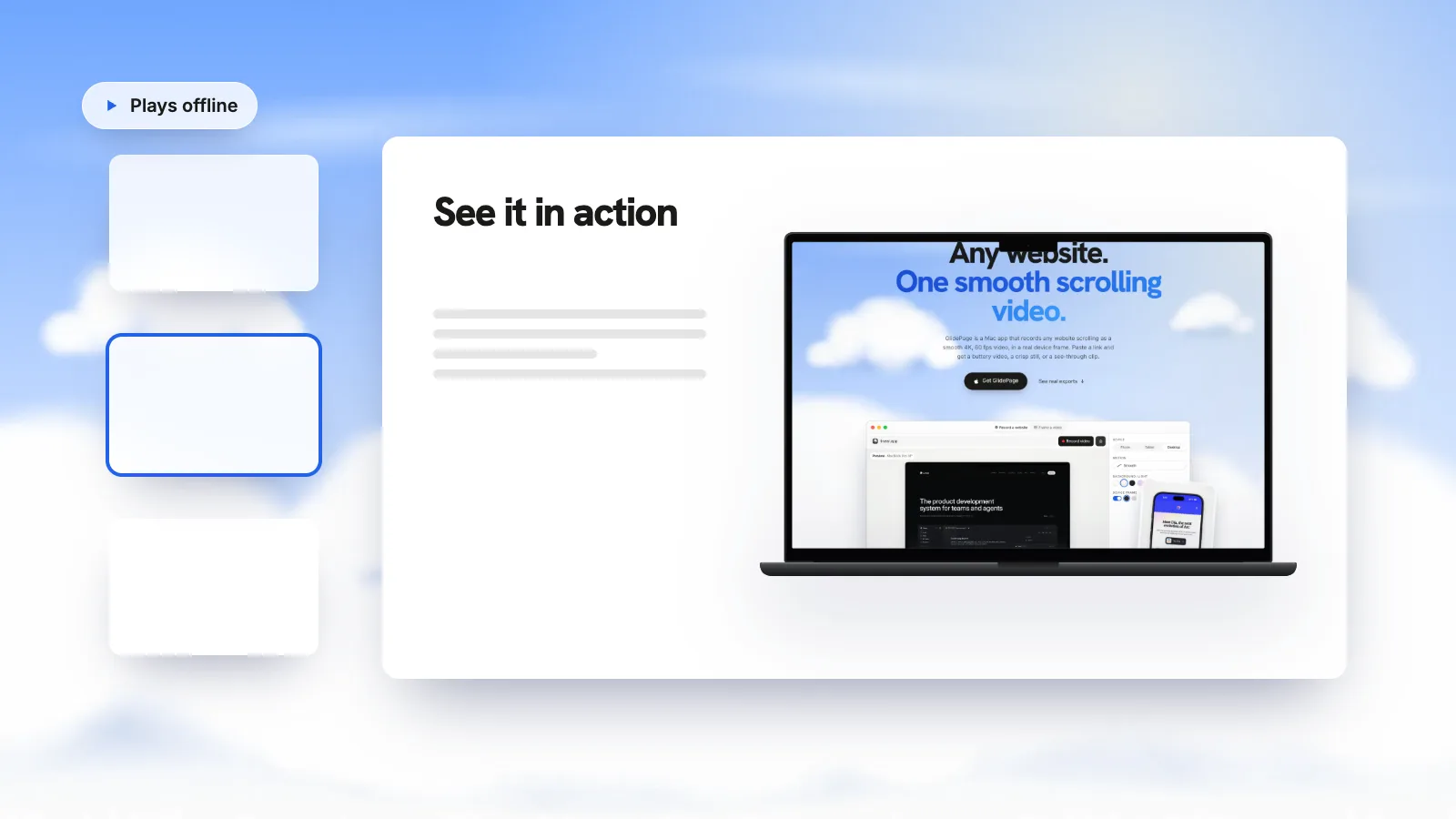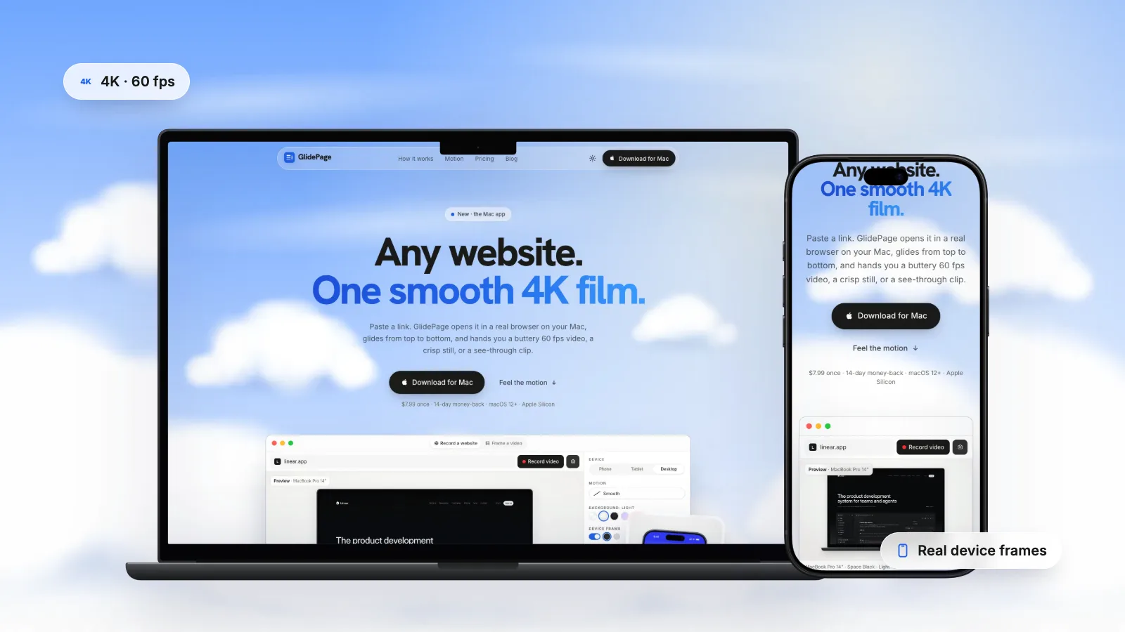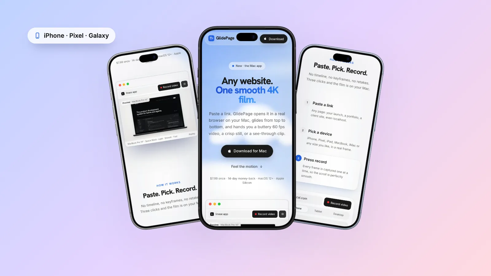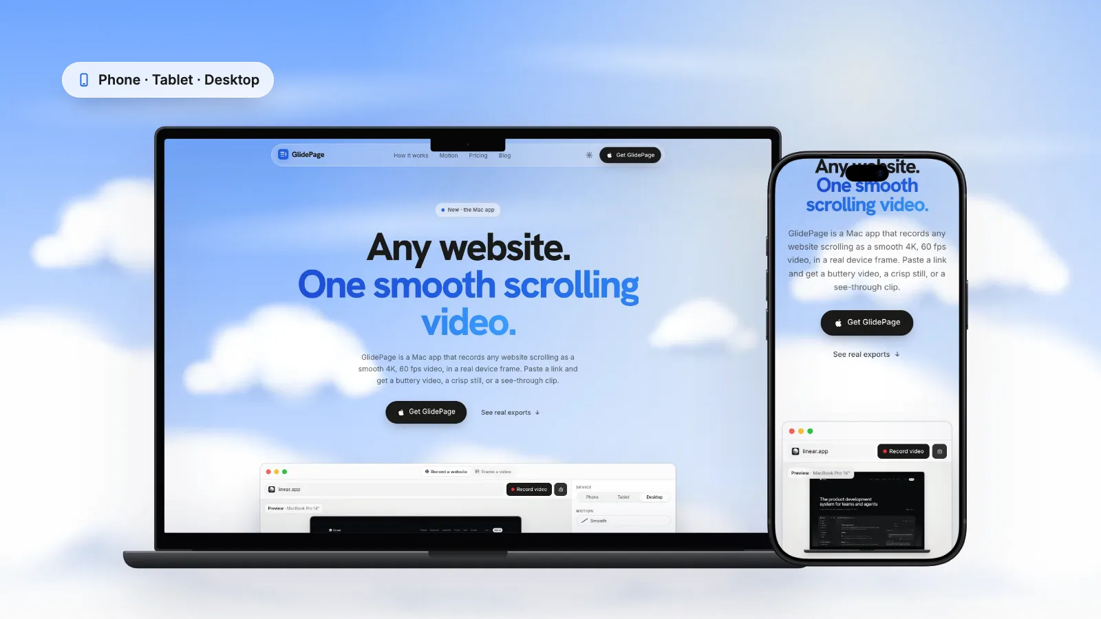
To show responsive design in a portfolio, capture the same page on a phone, a tablet and a desktop with identical settings (background, speed, aspect ratio and theme), then lay the clips or stills side by side in Keynote or a video editor. Dragging the browser window narrower only changes the width, so use Safari's Responsive Design Mode or Chrome's device toolbar to get closer to the real phone layout, keeping in mind that both are approximations. GlidePage, a Mac app for Apple Silicon, renders phone layouts with a real phone user agent and viewport inside real device frames and exports each device as a 4K video or still. It makes one device per export, so you combine them yourself.
On this page
- What a responsive showcase needs to prove
- Why a resized window is not always the mobile layout
- How far browser emulation gets you
- Pick the devices, pages and theme
- Lock one set of settings before you record
- Recording each device with GlidePage
- Put the devices side by side
- Where the set goes in a case study
- Common mistakes
Responsive design is the part of web work that a single screenshot hides. The client signs off a desktop layout, most visitors arrive on a phone, and the work in between (the navigation that collapses, the grid that restacks, the headline that rescales) rarely makes it into the case study.
Showing it well takes two things: capture each layout the way visitors actually get it, then present the set so the only differences between devices are design decisions, not recording settings. This guide covers both, from why a resized window often shows the wrong layout to putting the devices side by side.
What a responsive showcase needs to prove#
A portfolio visitor is asking one question: did this designer think about every screen? Your visuals answer it when they show the layout changing, not just shrinking:
- Navigation turning from a full bar into a menu button, or moving to the bottom of the screen.
- Grids restacking: three columns becoming one, or a row of cards becoming a swipeable strip.
- Type rescaling: a headline that fits the phone, instead of wrapping one word per line.
- Images reframing: a hero that is cropped or swapped for a tall screen rather than squeezed.
- Touch targets: buttons and links big enough for a thumb, with room between them.
If the phone version looks like the desktop version at a smaller size, the visual has failed, even when the live site is fine.
Why a resized window is not always the mobile layout#
The quick method most designers reach for: drag the browser window narrow and take a screenshot or a screen recording. For many sites that is enough, because CSS media queries respond to the width of the viewport. But width is all it changes. The browser in that narrow window still:
- Sends a desktop user agent. Some sites and themes check that string to decide what to serve, so they keep the desktop menu or skip a mobile-only section.
- Uses a mouse. The page receives click events and a pointer that can hover, so anything the site does differently for touch screens stays in its desktop form.
- Draws at your Mac's pixel ratio, so images chosen for a phone's screen density may not be the ones a phone loads.
- Has no safe areas. MDN notes that the safe-area inset values are 0 when the viewport is a plain rectangle, so a layout that keeps content clear of a notch or the home indicator shows none of that care.
- Shows no phone around the page. No status bar, no rounded corners. A crop of a desktop window looks like exactly that.
That is fine for a quick layout check, not for a portfolio, where the point is to show what a phone visitor sees.
How far browser emulation gets you#
Safari and Chrome can both pretend to be a phone, and both get much closer than a dragged window. Their own documentation is clear that neither is the phone.
Safari: Responsive Design Mode
- Turn on the Develop menu in Safari's Advanced settings.
- Open the page and choose Develop → Enter Responsive Design Mode (Control-Command-R).
- Pick a viewport preset from the list. Use the rotate button to swap to landscape, and the pixel ratio control to match a phone's density.
- If the site decides what to serve from the user agent, change it with the User Agent item in the Develop menu, then reload.
Apple is candid about the limits: viewport presets "offer a good approximation, but they don't represent exact layout, rendering, and behavior as experienced on an actual device", because a real phone has an address bar, an on-screen keyboard and its own handling of form fields. For true iPhone and iPad rendering, Apple points to the Open with Simulator menu in the same mode, which needs Xcode installed.
Chrome: the device toolbar
- Open DevTools and click Toggle device toolbar.
- Choose a phone from the Dimensions list, or stay on Responsive and type a width and height.
- Set Device Type to Mobile. Chrome's docs explain that this decides whether the page renders as a mobile or desktop viewport, and whether it fires touch or click events. If you cannot see the list, choose More options → Add device type.
- To be sure of the user agent, open the Network conditions panel, turn off Use browser default, pick a phone's string and refresh the page.
Chrome calls device mode "a first-order approximation" of a phone. The page still runs in desktop Chrome on your Mac's processor, and in the docs' own words, "there are some aspects of mobile devices that DevTools will never be able to simulate."
What each method changes
| Method | What changes | What stays the same as desktop | Good for |
|---|---|---|---|
| Dragged browser window | The viewport width | User agent, mouse input, pixel ratio, no safe areas | A quick look at breakpoints |
| Safari Responsive Design Mode | Viewport size, pixel ratio, user agent (from the Develop menu) | A real phone's address bar, keyboard and form behaviour | Checking layouts, recording a clip |
| Chrome device toolbar | Viewport size, mobile rendering, touch events, user agent (Network conditions) | It is desktop Chrome on a Mac processor | Checking layouts, recording a clip |
| A real phone | Everything | Nothing, but its browser bars and status bar are in the shot | The final check |
Whichever you use, scroll through the page once before recording so lazy images and fonts are loaded, then record only the viewport with Shift-Command-5 and Record Selected Portion.
Pick the devices, pages and theme#
Phone and desktop, or all three?
Phone and desktop is the minimum, and often enough. Add a tablet only when the design has a layout of its own at that size, such as a two-column grid. If the tablet just shows the phone layout stretched, it adds a device without adding an idea.
For the phone, a current iPhone suits most audiences; a Pixel or Galaxy makes sense for an Android-first product. Mobile website mockup videos covers choosing the model and frame colour.
Which pages
The home page is the obvious one, but often the least interesting responsively. Add one page where the decisions are hard to miss: a pricing table, a data table or a filterable gallery. That is where a reviewer sees you solved a real problem.
Light and dark
Show dark mode only if the site has a designed dark theme. Then either record every device in the same theme, or make two complete sets. A light phone next to a dark laptop reads as two different sites. Recording a website in dark mode covers how to switch it.
Lock one set of settings before you record#
The fastest way to make a responsive set look amateur is to vary everything at once: a phone on a gradient, a laptop on white, one fast and one slow. Decide once, write it down, and change only the device.
| Setting | Keep it identical because |
|---|---|
| Background | The devices should sit in the same world, so the eye compares layouts, not colours |
| Canvas aspect ratio | Matching shapes line up cleanly in a row or a grid |
| Motion curve and speed | Different speeds make one device look sluggish next to the other |
| Page theme | Light next to dark looks like two sites |
| Page zoom | Keep 100% everywhere, or the layout no longer matches what visitors see |
| Frame finish | One phone colour and one laptop colour, reused across the portfolio |
| Export settings | The same resolution and frame rate keep sharpness consistent |
| Build and date | Record every device from the same build, on the same day |
One difference remains: the phone video runs longer, because the mobile layout is taller. In one test recording of a landing page at the same speed, the laptop scroll lasted 22.7 seconds and the phone scroll 31.4. Trim them to the same length, or let the shorter clip hold on its last frame.
Save the settings with the project. If you already record every site at handoff, as web design portfolio videos suggests, this is the responsive version: the same saved settings, run once per device, on handoff day.
Recording each device with GlidePage#
GlidePage is a Mac app that turns a link into a smooth scrolling video or a sharp still. For a responsive set, the part that matters is that every device is rendered as that device, not as a resized desktop window:
- Paste the link. A public page, a staging site, or a local build on localhost.
- Pick the phone first. Phone layouts are rendered with a real phone user agent and viewport, so the site shows its actual mobile design. The frame includes the status bar and the Dynamic Island or notch placement, with safe areas respected, so content does not hide under them.
- Set the shared settings. Background, motion curve, speed, the canvas aspect ratio (Auto follows the device, or pick one shape such as 1:1 or 4:5 for every device), and the page theme. Speed is measured in seconds per screen and follows screen height, so a phone and a laptop feel alike at the same setting.
- Clear the page. Common cookie banners are hidden by default. Close a newsletter popup in Take control, or remove a chat bubble with Hide element.
- Press Record. It captures every frame one at a time and exports a 4K, 60 fps MP4. With Auto, a framed phone comes out at 2160 × 3840, a tablet at 3072 × 3840 and a desktop at 3840 × 2160.
- Change only the device and record again. An iPad or Android tablet, then a MacBook, iMac or a custom size from 320 to 2560 px per side.
- Take matching stills. In photo mode, press the camera, scroll to the same section on each device, and press again for a 4K PNG. With the frame on and no background, the PNG is transparent, ready to arrange.
To be clear about the limits: GlidePage makes one device per export. It does not put a phone, tablet and laptop together in one video or image, so you combine them yourself, which the next section covers. It also records only the top-to-bottom scroll: an open mobile menu or a tap interaction needs a short screen recording on a phone or in emulation.
Put the devices side by side#
A still in Keynote
On a Mac, Keynote is the quickest tool for this:
- Drag the device PNGs (or the MP4s) onto a slide.
- Resize them to a believable relative scale: the laptop largest, the phone smallest.
- Select them all, open the Arrange tab in the Format sidebar, and use the Align pop-up menu to put them on one baseline, for example their bottom edges.
- With three or more devices, choose Distribute → Horizontally to space them equally.
- Choose File → Export To → Images to save the slide as an image for your case study.
A video in an editor
For two devices, iMovie's split screen is free and quick: drag one clip above the other in the timeline, click Video Overlay Settings, choose Split Screen from the pop-up menu, then pick the position. iMovie crops both clips to fill each half, so record them on a square canvas with room around the device, and check the viewer before you export.
For three devices, use Final Cut Pro, Premiere Pro or DaVinci Resolve: put each clip on its own layer, scale and position it, and place one background underneath. Transparent exports make this easiest. GlidePage exports them as ProRes 4444 MOV with alpha (during the free trial, transparent exports need a license). Transparent background videos on Mac covers the format.
Which layout to use
| Layout | Best for |
|---|---|
| Three devices in a row, on one baseline | The top of a case study, a portfolio grid thumbnail |
| A large laptop with a phone overlapping its lower corner | Landscape feeds, hero images |
| One device at a time, same background, in sequence | Vertical feeds and slides, where small devices would be too tiny |
| The same section as a still on each device | Explaining one component's responsive behaviour |
Where the set goes in a case study#
Lead with the composite. Then show each device on its own, large enough to read, with a sentence about the decision it shows: why the navigation moved, why the table became cards. Finish with component stills at each size.
The same files travel well. Awwwards asks for a mobile screenshot next to the desktop one; Awwwards submission requirements lists what to prepare. For shots and project pages, see posting a website on Dribbble and Behance, and for a client meeting or a pitch, showing a website in a presentation. If the project is a redesign, record the old site's devices the same way too: website redesign before and after covers that.
Common mistakes#
| Mistake | What it looks like | Fix |
|---|---|---|
| A desktop page shrunk into a phone frame | Tiny text, a desktop menu, side-by-side columns on a phone | Record at a phone viewport with a phone user agent |
| Different settings per device | One device on a gradient, the other on white; one fast, one slow | Lock one set of settings and change only the device |
| Devices at random sizes in the composite | A phone as wide as the laptop | Keep a believable relative scale and one baseline |
| Content under the notch or status bar | The headline clipped at the top of the phone | Use a frame that respects safe areas, and check the top of the screen |
| A cookie banner on one device only | The phone hidden behind a consent sheet | Hide or dismiss banners before every take |
A responsive showcase is a small set: the right layouts, one set of settings, arranged so the design is what changes. For the recording itself, how to make a scrolling video of a website covers methods, speed and motion in depth.
Sources
- Chrome for Developers: Simulate mobile devices with device mode (checked October 2026)
- Chrome for Developers: Override the user agent string (checked October 2026)
- Apple Developer: Responsive Design Mode (Safari) (checked October 2026)
- MDN: env() and the safe-area inset variables (checked October 2026)
- Keynote User Guide for Mac: Position and align objects (checked October 2026)
- iMovie User Guide for Mac: Create a split-screen effect (checked October 2026)




Make your site move.
Any page, one smooth 4K video. Framed, on any background, or transparent. Free for 7 days, no card needed.
Questions, answered
How do I show mobile and desktop designs together in a portfolio?
Capture the same page on a phone and on a desktop with identical settings, then place them side by side in Keynote or a video editor, the laptop larger and the phone beside it or overlapping its corner. Keep the background, speed and theme the same so the only differences are the layouts.
Is a resized browser window good enough to show the mobile layout?
Sometimes. A narrow window changes the viewport width, which triggers most CSS breakpoints, but it still sends a desktop user agent, uses a mouse and has no safe areas. Sites that check the user agent or behave differently on touch screens can show the wrong layout, so use browser emulation or a real phone viewport for portfolio work.
Should I show devices side by side or one at a time?
Both, in different places. A side-by-side composite at the top of a case study shows the whole system at a glance. Further down, show each device on its own, large enough to read, next to a sentence about the decision it illustrates.
Do I need to show phone, tablet and desktop?
Phone and desktop are the minimum. Add a tablet only when the design has its own layout at that size; if the tablet just shows a stretched phone layout or a squeezed desktop one, it adds clutter rather than information.
Should I show light and dark mode in a responsive case study?
Only if the site has a designed dark theme. Record every device in the same theme, or make two complete sets, because a light phone next to a dark laptop looks like two different sites.
Can GlidePage put several devices in one video?
No. GlidePage records one device per export, so you combine the phone, tablet and desktop recordings or stills yourself in Keynote, iMovie or another editor. Recording each device with the same background, speed and aspect ratio makes them line up cleanly.